How to Choose Sophisticated Interior Paint Colors for a High-End Look
Nothing transforms a space quite like color. But when you want your home to radiate a high-end, sophisticated feel, picking the right paint colors can be intimidating. Too bold, and you risk an overwhelming space; too bland, and you lose that luxurious touch. Let’s break down how to strike the perfect balance so your interiors look polished, stylish, and timeless.
In this guide, you’ll learn:
- What makes a paint color “sophisticated”
- How to build a refined palette
- Mistakes to avoid
- A case study of a local homeowner who nailed their color upgrade
Read on to create the elegant look you’ve always wanted.
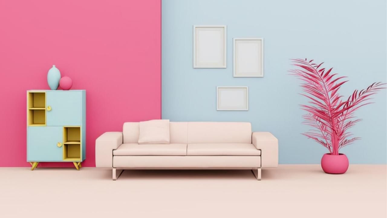
Define Sophisticated: What Makes a Color Feel Luxurious?
Sophisticated paint colors often share a few characteristics:
- Complex undertones: Rich neutrals with layered undertones look far more expensive than flat beige or stark white.
- Balanced saturation: They’re neither too bright nor too muddy, creating a calm, harmonious effect.
- Timeless appeal: Classic shades (think charcoal, navy, cream, or deep taupe) age gracefully and work with a wide variety of furnishings.
If you’re unsure, study luxury hotels or high-end showrooms—these spaces usually favor muted yet powerful colors with depth and subtlety.
Building a High-End Color Palette
You don’t have to stick with safe neutrals to get a sophisticated result. Follow these steps to build a refined palette:
- Start with a foundation: Choose one or two neutral anchor colors for main walls. Soft grays, warm whites, or mushroom tones are excellent starting points.
- Add depth with accent colors: Bring in moody blues, forest greens, or muted terracotta to highlight focal areas like dining rooms or bedrooms.
- Consider finishes: Eggshell and satin finishes reflect a subtle glow without appearing too glossy, perfect for upscale interiors.
- Stick to three or four complementary colors: This helps your home feel cohesive while allowing each room to have its own character.
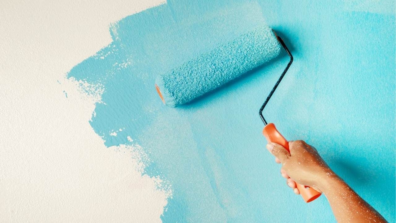
A pro tip? Always test paint samples on different walls and look at them in natural daylight before you commit. Lighting can shift a sophisticated gray to a greenish hue, which might surprise you later.
Mistakes to Avoid When Selecting Sophisticated Colors
Even luxury-minded homeowners can make slip-ups. Here’s what to watch for:
- Skipping undertone checks: Two grays can look identical on a swatch but clash on the wall due to different undertones.
- Overloading dark colors: While dramatic shades are in vogue, using too many can make your space feel cramped instead of refined.
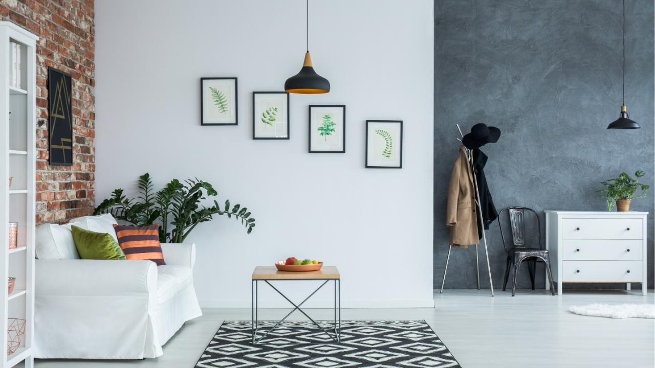
- Ignoring trim and ceilings: Mismatched trim or ceilings can ruin the high-end effect. Keep them crisp and intentional.
- Relying solely on trends: What’s hot today could look dated tomorrow. Timeless beats trendy every time.
If you’re ever in doubt, a color consultant or professional painters Central Oregon residents trust, like Ash Painting, can guide you in picking the ideal shades. Their experience delivering high-quality painting services ensures your color choices stand the test of time.
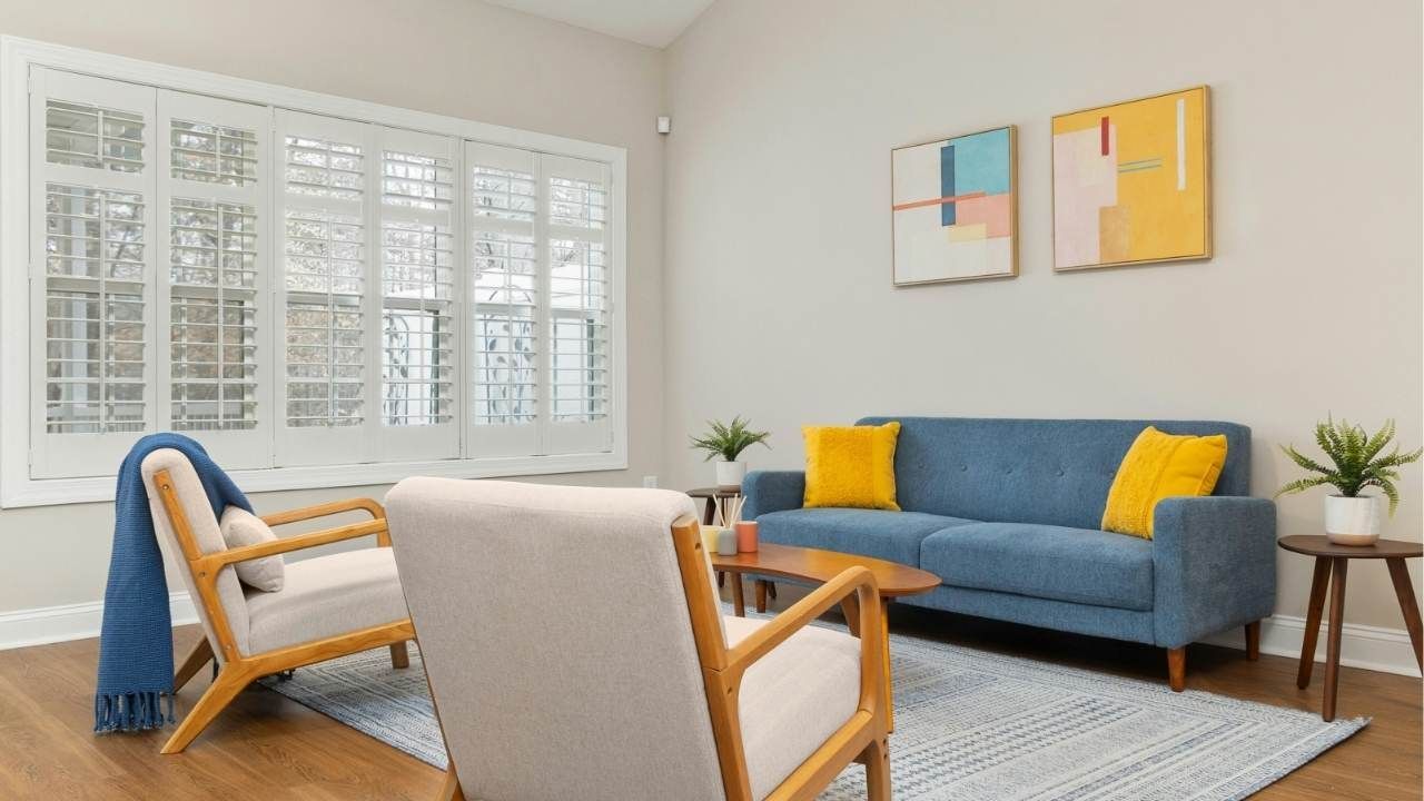
Case Study:
Last year, a homeowner in Oregon wanted to update their mid-century modern home, but keep its upscale feel. Working with a color consultant, they chose a soft putty gray for the living room walls, accented with a deep blue on built-in bookcases. The trim stayed a sharp, classic white to frame the palette beautifully.
The result? A serene, sophisticated space that felt both modern and classic — and increased their home’s perceived value.
Ready to elevate your home? If you want expert help selecting the perfect palette, contact Ash Painting, a leading name in painting services in the Central Oregon area. Their seasoned team can transform your space with colors that look sophisticated, cohesive, and worthy of a magazine spread.
Ash Painting Blogs