The Best Paint Colors for Waiting Rooms in a Doctor’s Office
A waiting room can instantly calm someone—or make their nerves spike. The color you choose for those walls matters more than most doctors realize. Before you grab a random shade of beige, it’s worth understanding which tones actually help patients feel safe and relaxed. A commercial painter in Central Oregon will tell you the same thing: paint is quiet, but its impact is loud.
In this guide, you’ll learn how different colors influence patient emotions, how to match palettes with your practice’s personality, and why hiring a local painting expert like Ash Painting helps you get it right the first time.
1. Why Color Choice Matters in Healthcare Spaces
Patients often spend more time in the waiting room than with their doctor. That’s a tough truth, but it’s exactly why design choices count. Color influences everything from blood pressure to perceived wait times, and smart practices use that to their advantage.
Cooler tones like blue or soft green naturally lower stress levels. Warm tones, when used sparingly, can make a space feel welcoming rather than sterile. The goal isn’t to impress—it’s to create comfort without overstimulation.
2. Calming Colors That Put Patients at Ease
If you want a waiting room that feels like a deep breath, start with these color families:
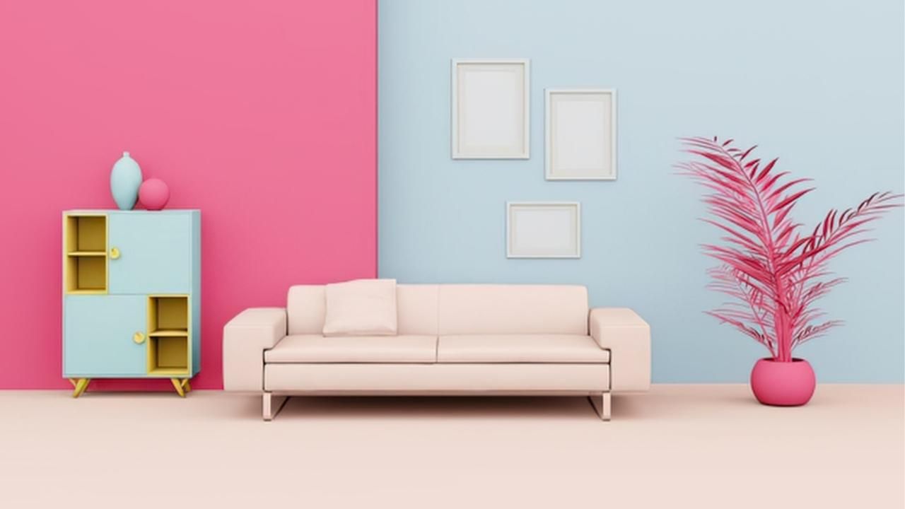
Soft Blues
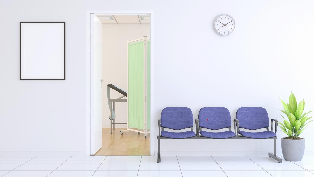
Nothing beats a gentle, airy blue for anxiety reduction. It signals safety, clarity, and cleanliness. Lighter shades also make small waiting rooms feel bigger.
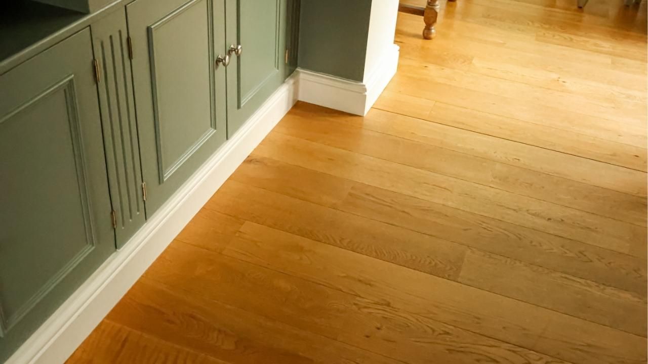
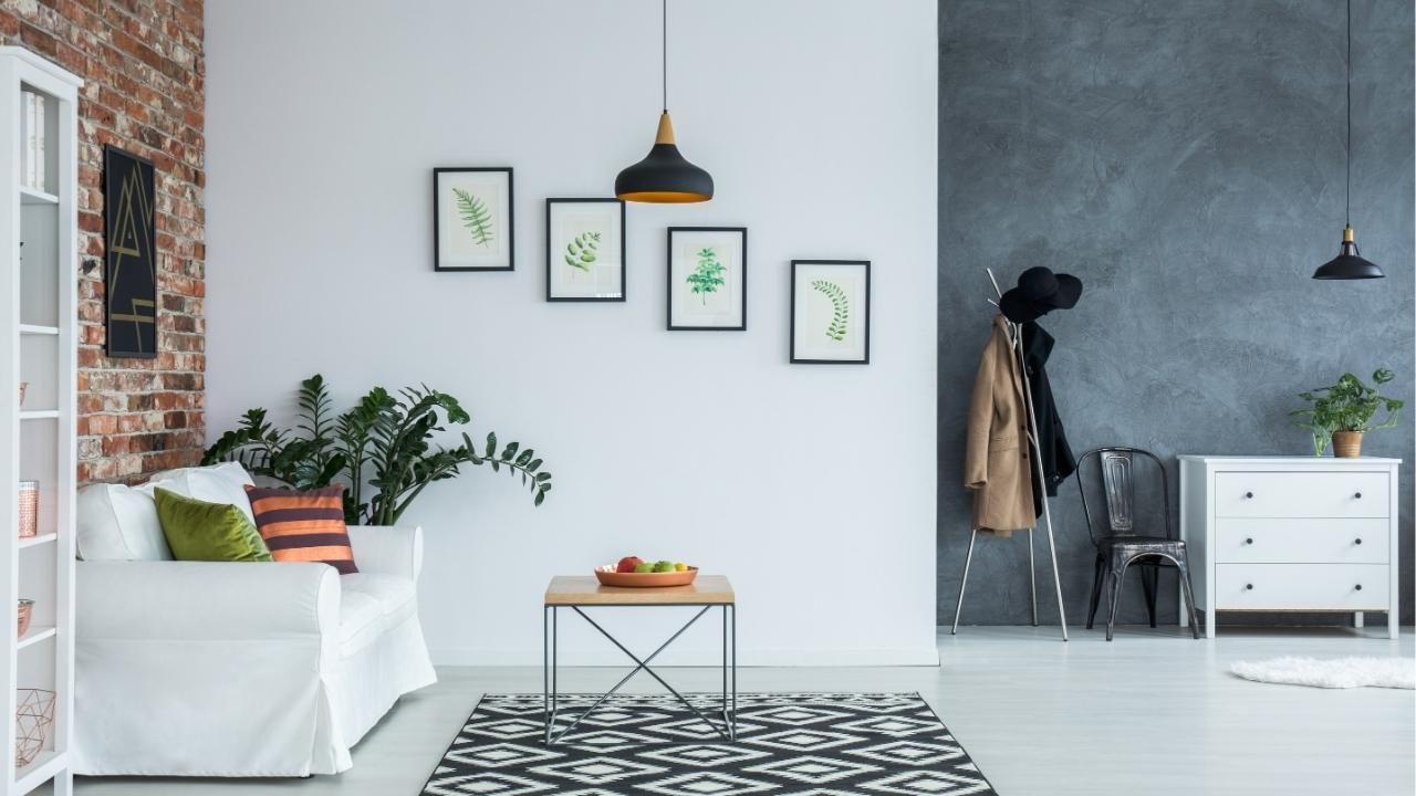
Warm Grays
Warm, muted gray tones feel modern but not cold. They pair well with white trim, wood textures, and minimalist art.
Muted Greens
Green is nature’s neutral. It’s soothing without being sleepy, and works especially well in practices that serve children, families, or general wellness clients.
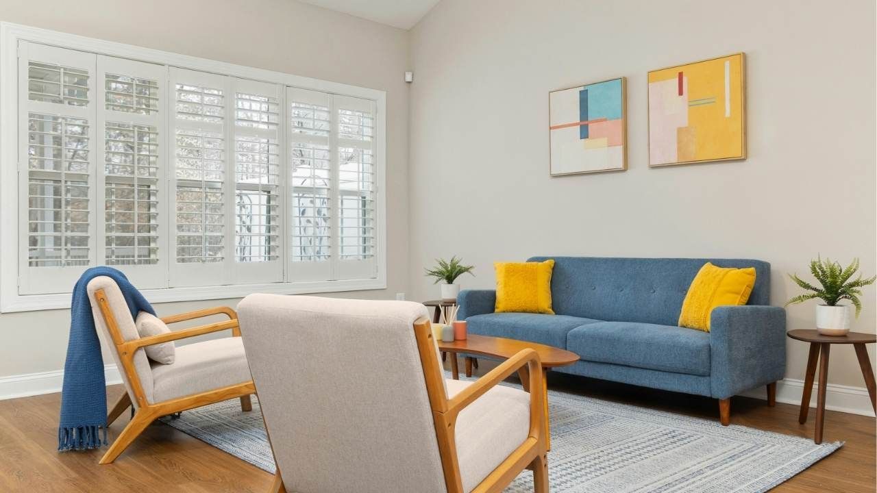
Warm Neutrals
Think soft tan, linen, or creamy whites. These colors create a home-like atmosphere and help reduce the “clinical” vibe patients dread.
3. Colors for Specialty Practices
Different specialties may benefit from different emotional tones:
- Pediatrics: Soft teal, pastel greens, and warm neutrals to help kids feel safe
- Dental Offices: Pale blues and warm grays to ease dental anxiety
- Mental Health Clinics: Earth tones and desaturated colors to promote grounding
- Chiropractors/Physical Therapy: Muted blues and greens that promote calm and connection
Avoid overly bright primary colors—they can overstimulate patients and make a space feel chaotic.
4. Case Study: A Waiting Room Transformation
A small family clinic in Oregon recently renovated a dated waiting area that felt cramped and harsh under fluorescent lights. They switched from deep tan walls to a palette of cool blue-gray with warm white accents. The shift changed everything. Patients immediately commented on how much calmer the room felt. Staff said the day felt less stressful because people were noticeably more relaxed from the moment they walked in. The clinic didn’t change its layout, furniture, or lighting—just the paint.
5. Practical Tips for Choosing the Right Shade
Here’s how to finalize a color that looks good today and years from now:
- Test samples on multiple walls
- View the color under natural and artificial lighting
- Avoid high-gloss; choose satin or eggshell for warmth
- Pair colors with simple décor to avoid visual clutter
- Choose palettes that align with your brand and patient experience
Final Thoughts
The best waiting room colors aren’t trendy—they’re timeless, clean, and calming. When your space communicates comfort before a word is spoken, patients notice.
Ready to refresh a medical office? Contact us today to choose a color that sets the right tone and elevates the experience from the moment someone walks in.
Ash Painting Blogs