How to Make Your Deck Pop with a Painted Railing or Accent Color
Most decks fade into the background. They’re there, they work, but they don’t wow. The fastest way to change that isn’t tearing boards out or starting over; it’s color. A smartly painted railing or accent detail can turn a plain deck into a focal point that looks intentional, finished, and expensive.
Here’s what you’ll learn: how to choose the right accent color, where it actually makes sense to use it, and how to avoid the common mistakes that make decks look busy or dated.
Why Accent Colors Work So Well on Decks
A deck is mostly horizontal. That’s the problem. Accent colors introduce contrast and vertical interest, especially when applied to railings, balusters, or trim.
When done right, accent colors:
- Add depth without overwhelming the space
- Highlight craftsmanship and clean lines
- Tie the deck visually to your home’s exterior
This is why experienced pros, like an exterior painter in Central Oregon, often recommend color contrast before structural changes. Paint delivers the biggest visual upgrade for the least money.
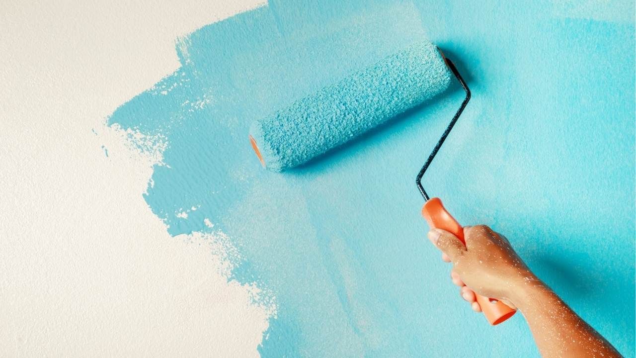
Choosing the Right Accent Color (Don’t Guess)
Accent colors fail when homeowners pick them in isolation. Your deck doesn’t live alone—it’s part of a larger palette.
Start here:
- Pull from your house color. A darker or lighter variation usually works.
- Match existing elements. Roof tones, window trim, or stone features are fair game.
- Use contrast, not clash. Black, charcoal, deep bronze, and muted greens are safe power colors.
Avoid ultra-bright hues unless your home already leans modern or coastal. Loud colors age fast and limit future resale appeal.
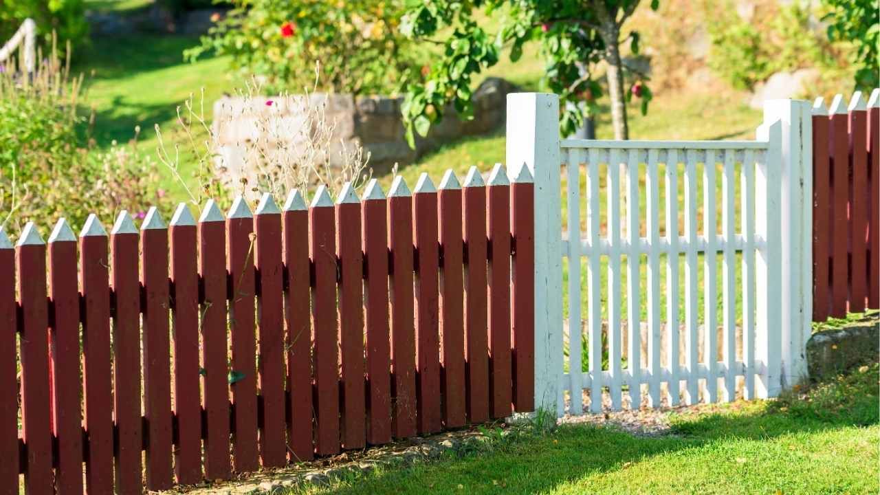
Where Accent Color Makes the Biggest Impact
You don’t need to paint everything. In fact, you shouldn’t.
High-impact areas:
- Railings and handrails
- Balusters or spindles
- Stair risers (not treads)
- Picture-frame borders around the deck edge
Leave the main deck boards in a natural or semi-transparent stain. This keeps the space grounded and lets the accent color do its job without overpowering the design.
If your deck was recently installed as part of a deck building project, accents are even more effective because clean lines amplify contrast.
Finish Matters More Than Color
Here’s the truth most people miss: sheen can make or break your deck.
- Satin or semi-gloss works best for railings—easy to clean, sharp-looking.
- Flat finishes hide flaws but collect dirt.
- High gloss looks great for about five minutes, then shows everything.
Professional painting crews like Ash Painting of Central Oregon prioritize finish selection because durability and maintenance matter just as much as appearance, especially in changing climates.
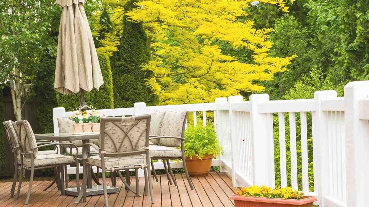
Short Case Study: Simple Change, Big Upgrade
A Central Oregon homeowner had a standard pressure-treated deck that blended into the yard. The structure was solid, but visually forgettable. Instead of replacing anything, they painted the railings a deep charcoal while keeping the deck boards a warm wood tone. The result was immediate: sharper contrast, cleaner lines, and a deck that finally matched the home’s modern exterior. Neighbors assumed it was a full remodel. Total cost? A fraction of rebuilding, proof that smart color choices outperform brute-force upgrades.
The Bottom Line
If your deck looks tired, don’t default to demolition. Strategic paint on railings and accents can elevate the entire space fast. Choose contrast wisely, limit where you apply it, and respect the finish. Done right, your deck won’t just exist in your backyard. It’ll stand out.
Next step: Walk outside, look at your deck from the yard, and ask one honest question: where does it need contrast? To learn more, contact us.
Ash Painting Blogs