The Best Family Room Paint Colors for Comfort and Connection
When you walk into a family room, the colors on the walls set the tone long before anyone speaks. The right shade can make people feel calm, welcomed, and ready to settle in. That’s why many homeowners turn to painters in Central Oregon when they want to refresh a room that brings everyone together.
Family rooms do more than hold a couch and TV—they’re where birthdays happen, arguments cool down, and late-night laughs echo. Choosing colors with intention supports all those moments. Whether you’re updating your space yourself or working with Ash Painting of Central Oregon, the goal is the same: create a room that feels connected, warm, and lived-in.
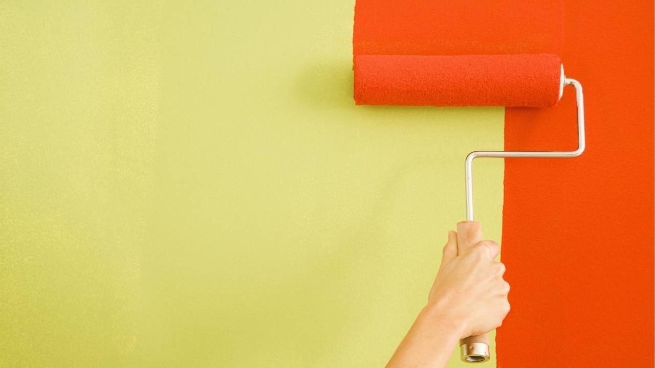
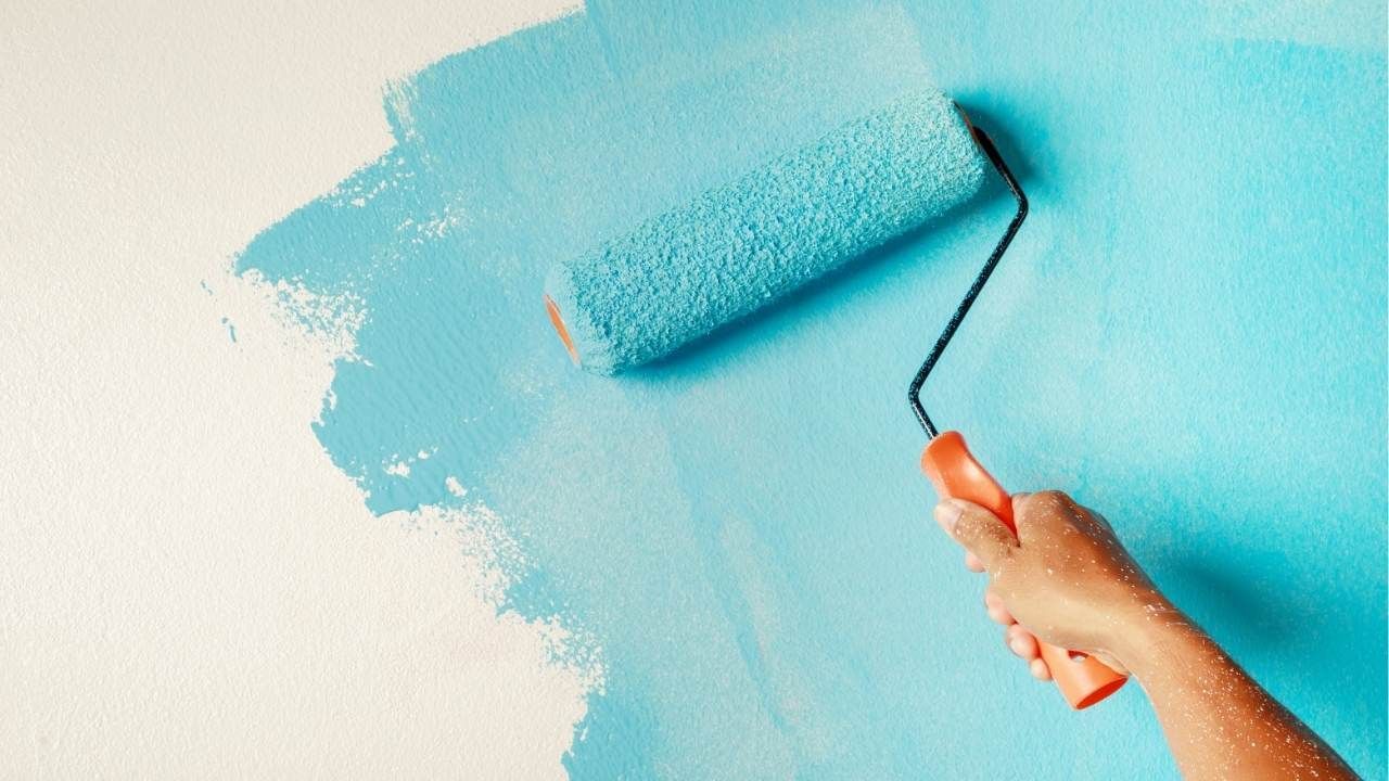
In fact, any seasoned interior painting pro will tell you that paint is one of the fastest ways to shift the emotional energy of a space. Below, you’ll find the colors that consistently strike the perfect balance between comfort and connection.
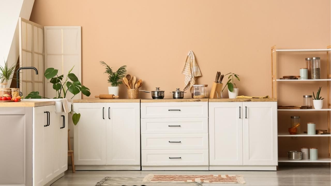
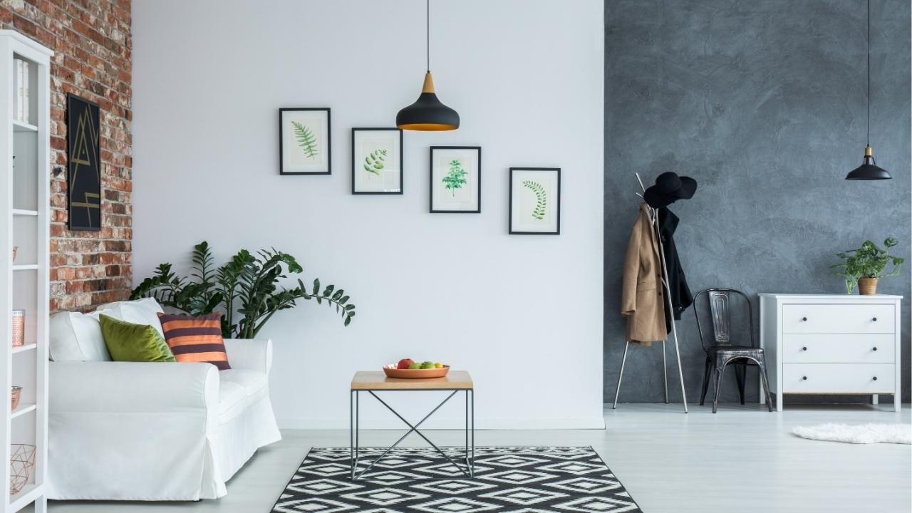
Warm Neutrals: Calm, Cozy, and Easy to Live With
Warm neutrals have dominated family rooms for years—and for good reason. Shades like creamy beige, soft greige, and warm taupe instantly make a room feel inviting without overwhelming the eye. They also pair effortlessly with any décor style, whether you’re into modern, rustic, or traditional design.
Warm neutrals work especially well if you have a lot of natural light. They soften harsh shadows and keep the room feeling comfortable throughout the day. Plus, they’re ideal for households where furniture or décor may change over time because they allow maximum flexibility.
Try these shades:
- Soft almond
- Warm oatmeal
- Light caramel
- Greige with a warm undertone
If your family room is the heart of the home—and let’s be honest, for most families it is—you can’t go wrong with this palette.
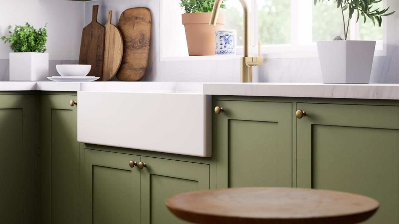
Earthy Greens: A Natural Way to Encourage Relaxation
Green is often described as a “reset button” for the brain. It brings the calming energy of nature indoors and helps people feel grounded. Earthy greens, in particular, create a subtle yet soothing atmosphere that’s perfect for winding down after a long day.
Think muted olive, moss, and sage—colors that stay soft and approachable. Families who want a more organic, outdoorsy feel tend to gravitate toward these tones because they add personality without becoming too bold.
Good pairings include:
- Natural wood furniture
- Cream or linen upholstery
- Black metals for contrast
- Woven accents like jute or rattan
If your family room opens up to a backyard or patio, choosing earthy greens helps create a seamless visual flow.
Soft Blues: Peaceful, Balanced, and Easy on the Eyes
Soft, airy blues are another top choice for family rooms because they promote calm without making a space feel cold. These shades mimic the sky and bring a refreshing openness into a room.
Blues work especially well in busier households where the family room is constantly in use. They help bring a sense of order and serenity, even when the space is full of backpacks, toys, and half-finished puzzles.
Consider pale slate, powder blue, or muted denim for a look that blends comfort with subtle sophistication.
Case Study: A Family Room Transformation That Changed Everything
A family in Bend recently wanted a room makeover that supported both quiet evenings and weekend gatherings. Their old walls were a dull beige that made the room feel flat. After exploring options, they chose a warm sage green with soft white trim. The result? The space instantly felt more connected to their outdoor view, and the room became the most-used spot in the house. They later added textured throw pillows and natural wood accents, completing the transformation and creating a room that finally matched how they lived.
Final Thoughts
Your family room deserves more than a quick color guess. Paint has the power to shape how people feel, interact, and relax. Choose thoughtfully, and you’ll create a space everyone gravitates toward—day after day.
Ready to update your family room? Contact us to start planning your color palette and bring your vision to life.
Ash Painting Blogs