How to Choose Paint Colors That Actually Work Together
Choosing paint colors sounds simple, until you’re staring at dozens of swatches that somehow all look wrong together. One shade feels too cold, another too loud, and suddenly your “quick update” turns into a frustrating guessing game.
The truth is, great color combinations aren’t random. There’s a method behind why some rooms feel calm and cohesive while others feel off. In this guide, you’ll learn how to pick paint colors that actually work together without second-guessing every decision.
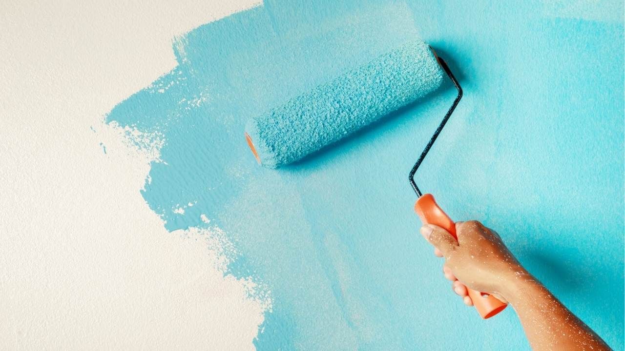
Start with a Clear Base Color
Every well-designed space begins with a dominant color. This is your anchor, the tone that sets the mood for the entire room. Whether you're planning interior wall painting for a living room or bedroom, this first choice matters more than anything else.
Here’s how to pick it right:
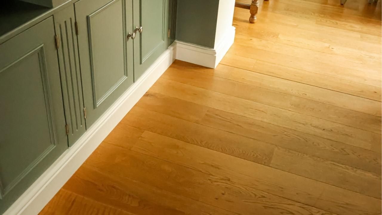
- Look at existing elements (floors, furniture, cabinets)
- Choose a color that complements, not fights those features
- Stick to undertones (warm vs. cool) for consistency
If your floors have warm brown tones, lean toward warm neutrals like beige or creamy whites. If they’re gray or cool-toned, go with crisp whites or soft grays.
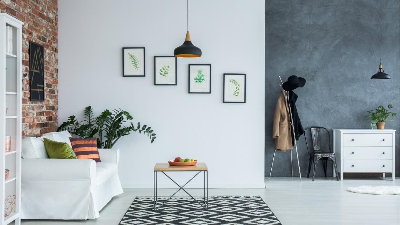
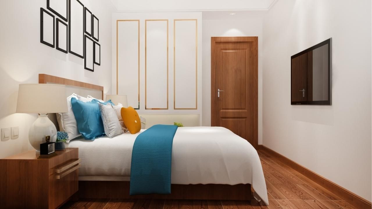
Use the 60-30-10 Rule
This is one of those simple rules that actually works in real homes. It keeps your space balanced instead of chaotic.
Break your colors down like this:
- 60% – Dominant color (walls)
- 30% – Secondary color (furniture or large accents)
- 10% – Accent color (decor, pillows, art)
This structure creates visual flow. You’re not just picking colors, you’re assigning them a role.
For example, your walls might be soft gray (60%), your sofa navy blue (30%), and your accents mustard yellow (10%). It feels intentional, not random.
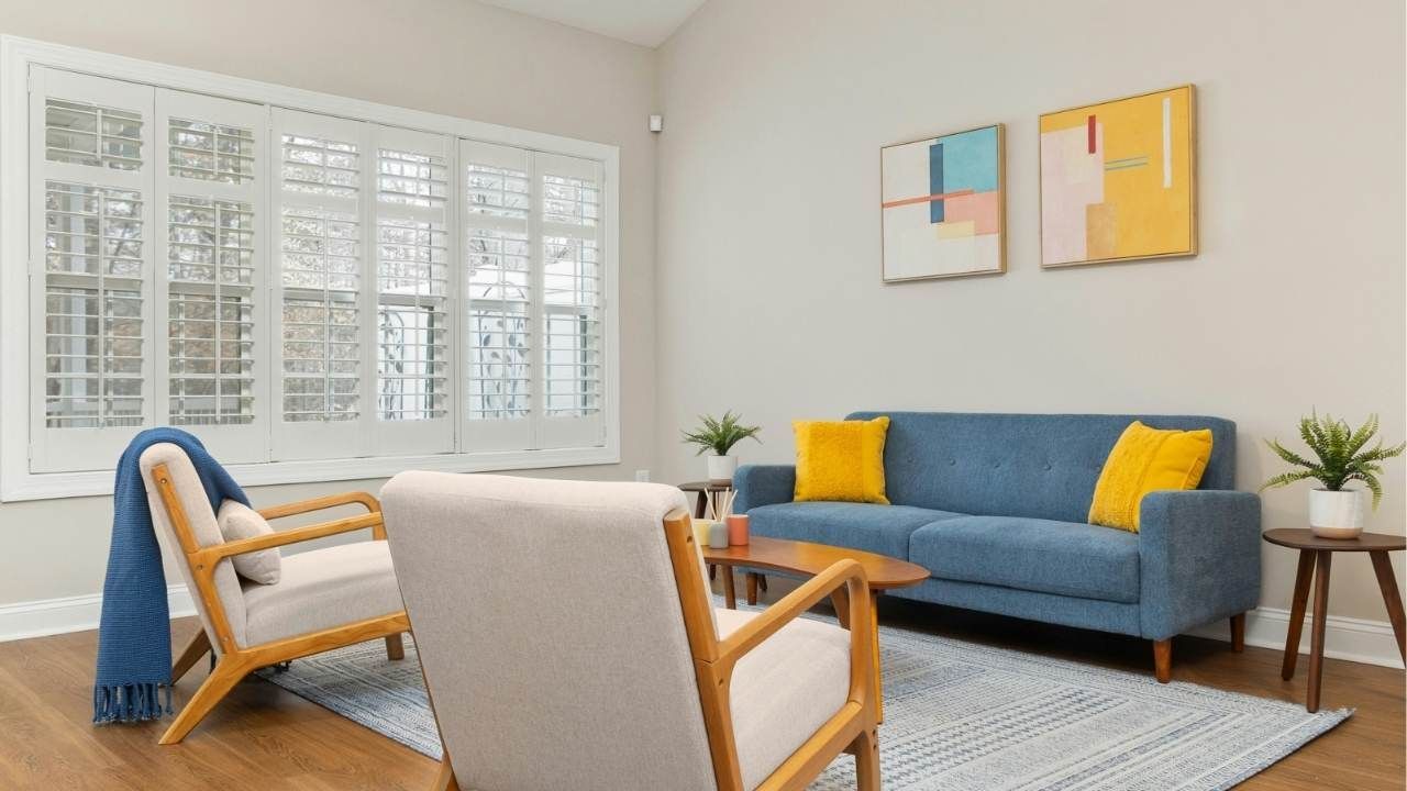
Understand Color Temperature
Here’s where most people mess up, they mix warm and cool tones without realizing it.
Warm colors include:
- Beige
- Cream
- Warm taupe
- Soft yellows
Cool colors include:
- Gray
- Blue
- Crisp white
- Charcoal
Mixing them can work, but it needs to be controlled. A good rule? Keep your base color and secondary color in the same temperature family, then use contrast sparingly in accents.
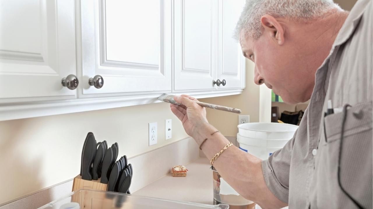
If you’re unsure, a professional offering painting services can help you spot these differences quickly and avoid costly mistakes.
Test Before You Commit
Paint never looks the same on a wall as it does on a tiny swatch. Lighting, shadows, and surrounding colors all change how it appears.
Before finalizing:
- Paint sample patches on different walls
- Check them at different times of day
- Observe how artificial lighting affects the color
Morning light can make colors feel cooler, while evening light warms everything up. What looked perfect in the store might feel completely different at home.
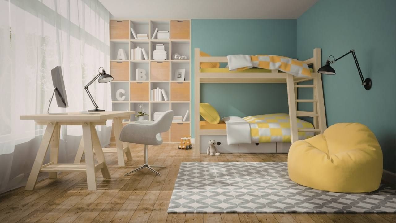
Don’t Overcomplicate the Palette
More colors doesn’t mean better design. In fact, too many shades can make a space feel cluttered and confusing.
Stick to 2–4 main colors per room. That’s it.
If you want variety, use different shades of the same color instead of adding new ones. For example:
- Light gray walls
- Medium gray furniture
- Dark charcoal accents
This creates depth without chaos.
When to Bring in a Pro
There’s no shame in getting expert help, especially if you’re working on multiple rooms or open spaces. Searching for a “skilled painting contractor near me in Central Oregon” can help you create a cohesive color flow throughout your home, not just one room.
They’ll also consider things most homeowners overlook, like:
- Transition areas between rooms
- Ceiling color impact
- Trim and molding contrast
These details make the difference between a “nice” result and a polished, professional look.
Real-Life Example: A Simple Color Fix That Worked
A homeowner wanted to refresh their open-concept living and dining area but couldn’t figure out why their colors felt off. They had cool gray walls, warm brown furniture, and bright white trim; nothing matched.
Instead of repainting everything, they made three smart changes:
- Switched to a warmer gray with beige undertones
- Updated trim to a softer off-white
- Added warm-toned decor accents
The result? The entire space felt cohesive and inviting without a full overhaul.
Final Thoughts: Keep It Simple and Intentional
Choosing paint colors that work together isn’t about being artistic, it’s about being strategic. Start with a strong base, stick to a clear structure, and test everything before committing.
If you’re ready to upgrade your space with confidence, contact us today and let experienced professionals guide your next painting project from start to finish.
Ash Painting Blogs