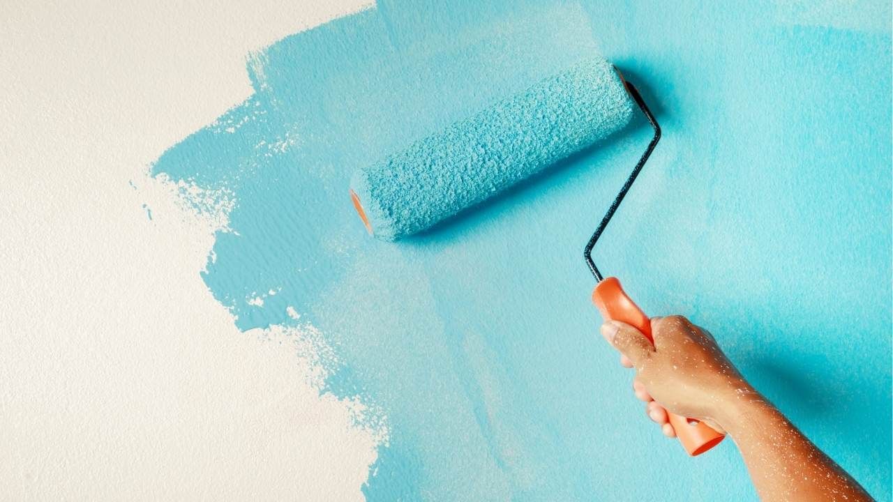
Two-Tone Walls: How to Pull Off This Trendy Interior Look
Plain white walls are safe. But safe doesn’t always mean memorable. If your space feels flat or unfinished, two-tone walls might be the upgrade you didn’t know you needed.
This design trend adds depth, personality, and structure to a room without overwhelming it. In this guide, you’ll learn how to choose the right color combinations, where to place the dividing line, and how to make the look feel intentional, not accidental. If you’re already working with house painters in Central Oregon or consulting interior painting contractors, this is the perfect time to explore something bolder. Even homeowners planning larger upgrades like deck building often use interior updates to create a cohesive overall aesthetic.
Let’s break down how to get it right.
Why Two-Tone Walls Work So Well
Two-tone walls aren’t just trendy, they’re strategic.
By splitting a wall horizontally or vertically, you can:
- Make ceilings appear higher
- Create visual balance in large rooms
- Add warmth without overpowering the space
- Define zones in open-concept layouts
It’s a simple trick with a big payoff. Instead of relying on furniture or décor to add contrast, the walls do the heavy lifting.
For example, darker tones on the lower half of the wall ground the room. Lighter shades above keep it airy. The result feels polished and thoughtfully designed.
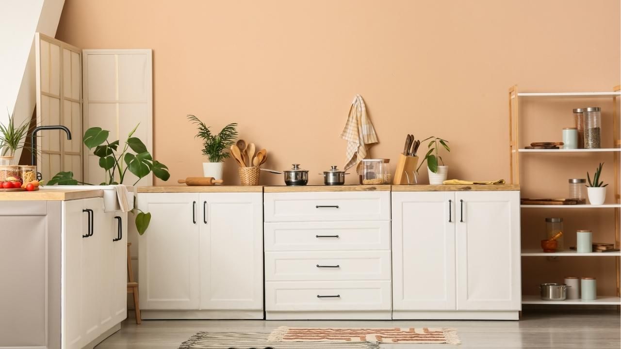
And the best part? You don’t need bold, dramatic colors to make it work. Even subtle contrasts, like warm beige paired with soft cream, can transform a space.
Choosing the Right Color Combinations
This is where most people get stuck. The key is contrast with harmony.
Here are a few proven approaches:
- Light + Dark: Navy on the bottom, crisp white on top
- Neutral + Earthy: Taupe paired with muted sage
- Soft Monochrome: Two shades from the same color family
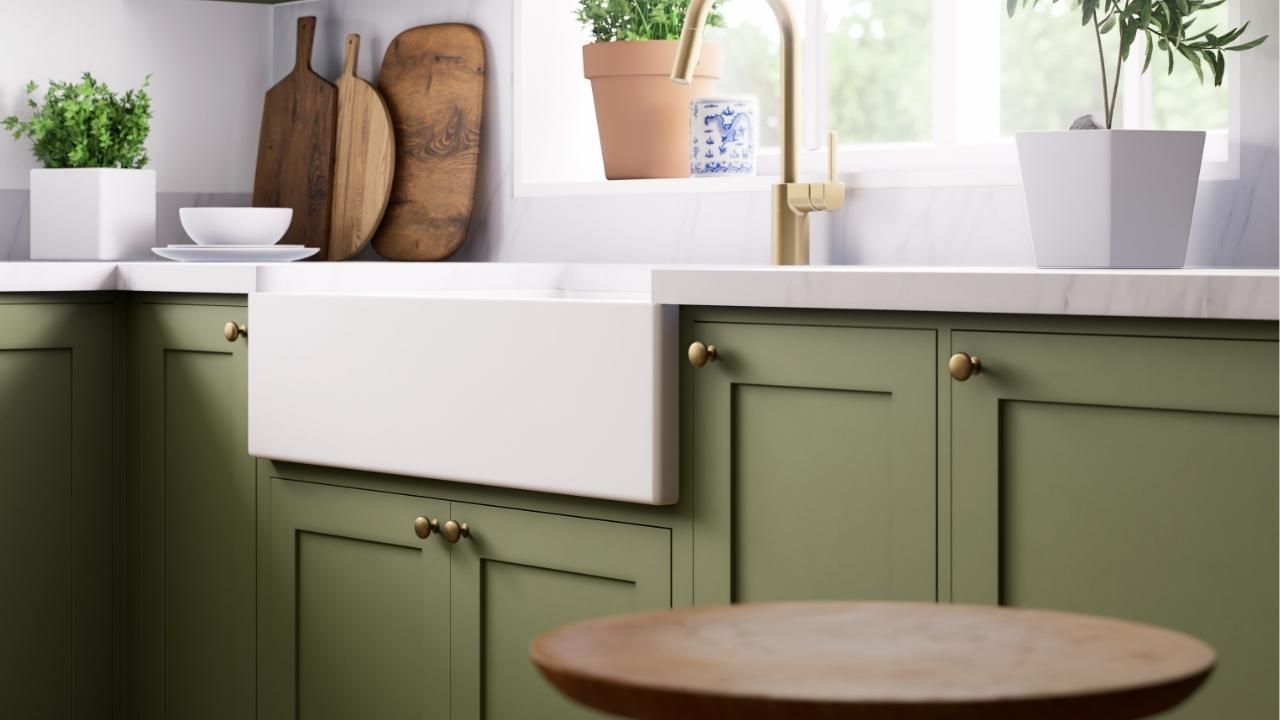
- Bold Accent + Neutral: Deep green balanced with warm gray
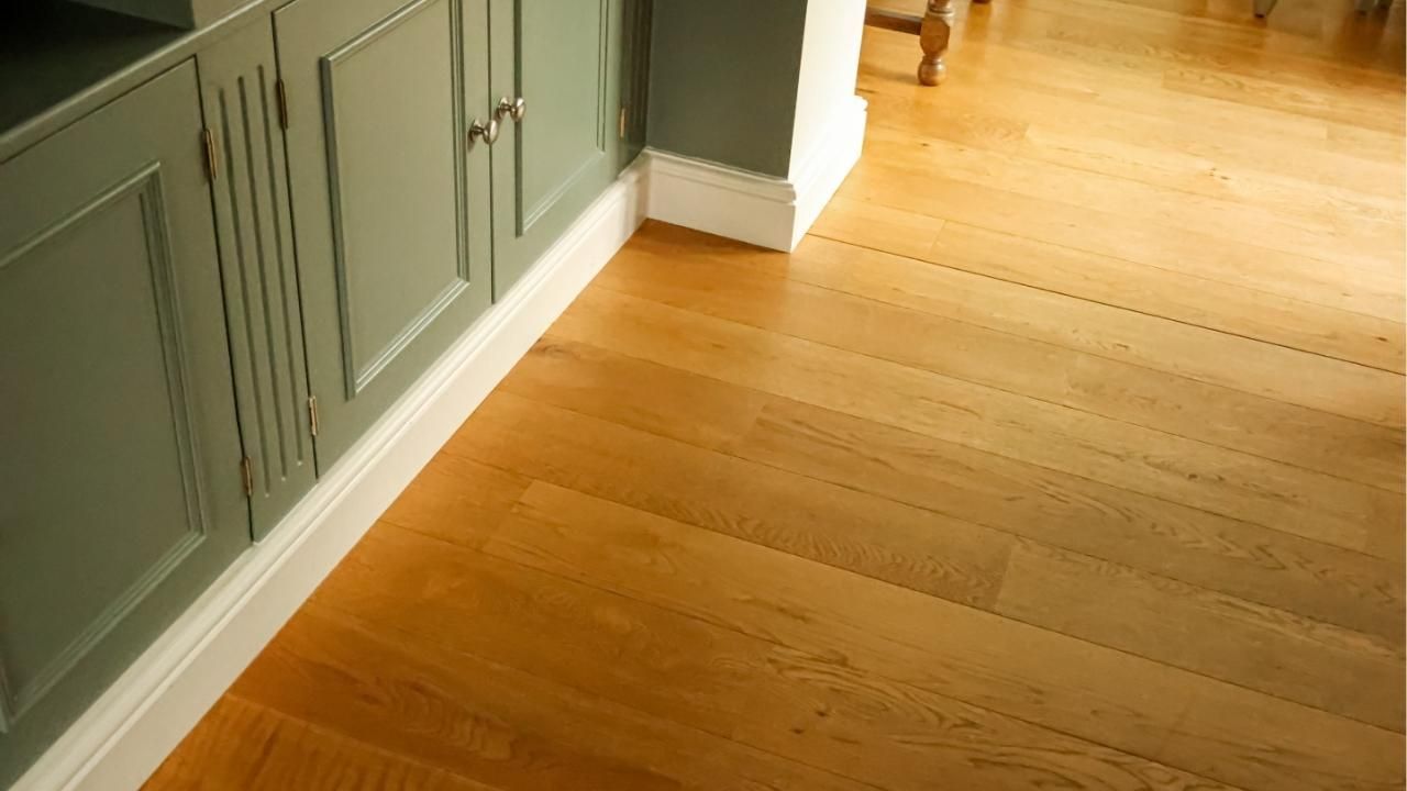
If you’re unsure, start with colors already present in your flooring, cabinetry, or furniture. Pulling tones from existing elements keeps everything cohesive.
Avoid pairing colors with clashing undertones. A cool gray and a warm beige can fight each other if not carefully selected. When in doubt, test samples on the wall and observe them in different lighting throughout the day.
Lighting changes everything. What looks perfect at noon may feel too heavy at night.
Where to Place the Divider Line
The placement of the dividing line makes or breaks the design.
The most common rule? Position it about one-third of the way up from the floor. This creates a classic, balanced look.
But that’s not your only option.
You can also:
- Align the line with window sills
- Match the height of existing furniture
- Install a chair rail for a clean physical break
- Go vertical to highlight architectural features
For modern homes, a sharp, tape-defined horizontal line feels sleek. In more traditional spaces, molding or trim adds character and polish.
Precision matters here. Uneven lines are instantly noticeable. If you’re not confident with a level and painter’s tape, hiring professionals ensures a crisp finish.
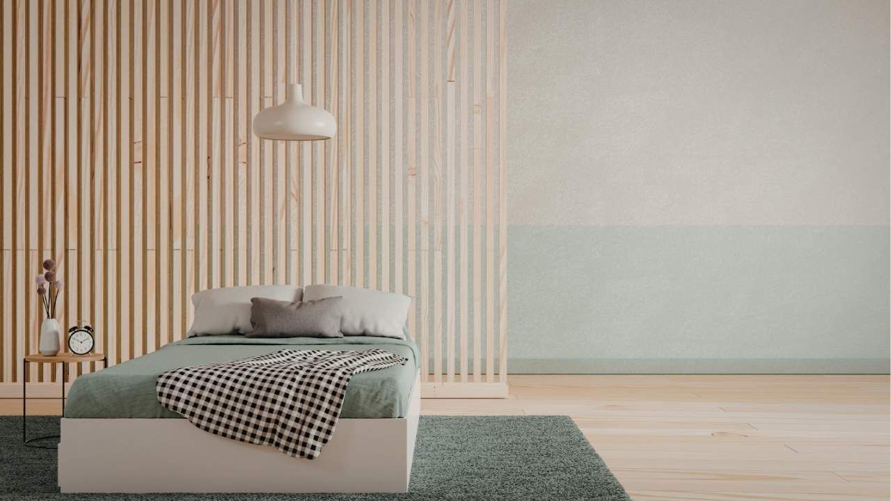
A Quick Case Study: From Flat to Finished
A homeowner had a large living room with high ceilings but minimal architectural detail. The walls were plain white, and despite expensive furniture, the space felt unfinished.
Instead of repainting everything one solid color, they chose a two-tone approach. The bottom third of the walls was painted a rich charcoal, while the top remained a warm off-white. A slim chair rail separated the two.
The change was dramatic. The darker lower section anchored the room, making it feel grounded and intentional. The lighter upper walls kept the space bright and open. Without adding new furniture or décor, the room suddenly felt custom-designed.
Sometimes the smartest upgrade isn’t bigger, it’s smarter.
Common Mistakes to Avoid
Before you commit, watch out for these pitfalls:
- Choosing colors with mismatched undertones
- Placing the dividing line too high or too low
- Forgetting to factor in ceiling color
- Rushing prep work and ending up with uneven edges
Preparation is everything. Clean walls, proper priming, and high-quality paint make a noticeable difference in the final result.
Two-tone walls are bold without being risky. They add structure, personality, and depth to almost any room. If your space feels one-dimensional, this design move can completely shift the energy.
Ready to elevate your interiors with a clean, professional finish? Contact us today and bring your vision to life.
Ash Painting Blogs