The Best Paint Colors for Bedrooms to Promote Better Sleep
Sleep is one of the most important parts of a healthy lifestyle, yet many people overlook how their environment affects their ability to rest. Lighting, noise, and temperature matter, but color plays a surprisingly powerful role too. The paint on your bedroom walls can either calm your mind or keep it stimulated when you should be winding down.
If you’re considering a bedroom refresh, choosing the right color palette can help create a more peaceful, sleep-friendly space. In this guide, you’ll learn which colors encourage relaxation, why they work, and how to use them effectively in your bedroom design.
Why Bedroom Color Affects Sleep
Color psychology has a real influence on mood and behavior. Certain colors signal calmness and stability, while others increase energy and alertness. Since the bedroom is meant to be a restful environment, your color choices should support relaxation rather than stimulation.
Many homeowners exploring painting services for a bedroom makeover often start by asking a residential painter in Central Oregon for guidance on sleep-friendly colors. A trusted local painting expert understands that the right shade can transform a room from stimulating to soothing.
Colors that promote better sleep typically share a few characteristics:
- Soft, muted tones rather than bright or bold shades
- Cool undertones that calm the mind
- Natural hues that mimic relaxing outdoor environments
Choosing the right palette doesn’t just improve the look of your room, it can actually help your body prepare for rest.
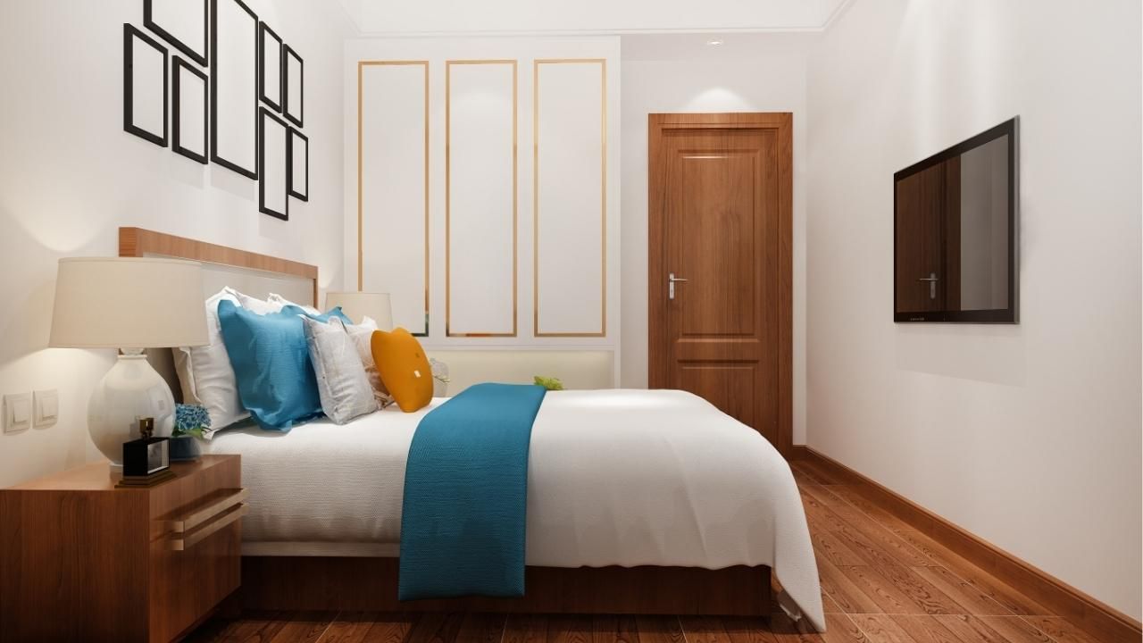
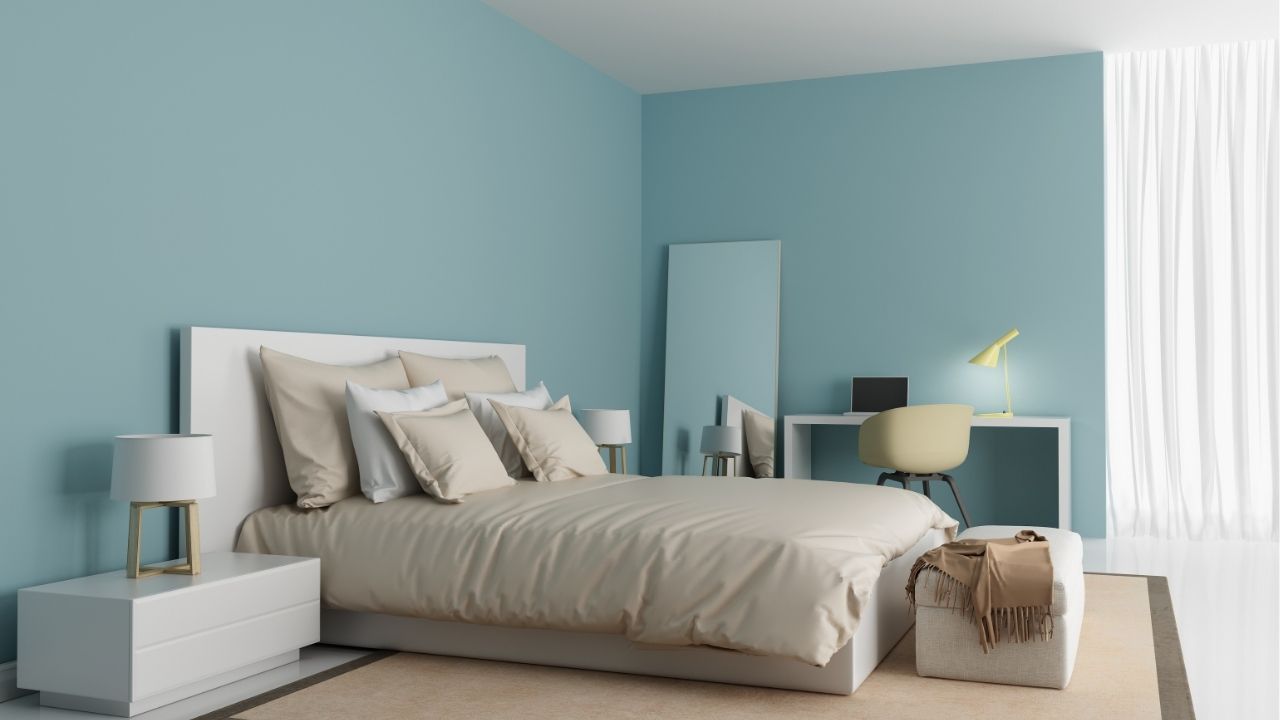
Soft Blues: The Ultimate Sleep Color
Blue consistently ranks as one of the best colors for promoting relaxation. It reminds us of calm skies and quiet water, both of which naturally signal peace and stability to the brain.
Soft blue tones are especially effective because they:
- Reduce feelings of stress
- Lower heart rate and blood pressure
- Create a tranquil atmosphere
Popular shades include:
- Powder blue
- Misty blue-gray
- Pale coastal blue
Avoid extremely dark or highly saturated blues, which can make the room feel heavy. Instead, aim for light, airy tones that reflect natural light during the day and feel soothing at night.
Gentle Greens for Natural Calm
Green is another excellent color choice for a bedroom because it mirrors nature. Our brains associate green with balance, growth, and harmony.
When used in a bedroom, green tones can:
- Promote emotional calm
- Reduce visual strain
- Create a fresh yet relaxing environment
Ideal green shades include:
- Sage green
- Soft eucalyptus
- Muted olive
- Pale moss
These shades pair beautifully with neutral bedding and natural wood furniture, creating a bedroom that feels peaceful and grounded.
Warm Neutrals That Encourage Relaxation
While blues and greens often get the spotlight, warm neutrals can also help create a restful bedroom. These tones add comfort without overwhelming the senses.
Some of the most effective neutral shades include:
- Warm beige
- Light taupe
- Soft greige
- Creamy off-white
Neutrals work particularly well if you want flexibility in your décor. They create a calm backdrop that allows bedding, lighting, and textures to define the mood of the space.
Another benefit of neutral colors is their versatility. They blend seamlessly with both modern and traditional design styles, making them a safe and timeless choice.
Case Study: A Bedroom Transformation
A homeowner recently decided to repaint their master bedroom after years of living with bright yellow walls. While cheerful during the day, the color felt overly stimulating at night.
After consulting with a painting professional, they chose a muted blue-gray shade with warm undertones. The change was immediate. The room felt cooler, quieter, and more relaxing.
Within weeks, the homeowner reported falling asleep faster and feeling more comfortable spending quiet evenings in the space. The simple shift in color transformed not only the room’s appearance but also the way the space supported rest and relaxation.
Colors to Avoid in Sleep Spaces
Some colors may look beautiful but aren’t ideal for bedrooms designed for rest. Highly stimulating colors can keep the brain alert when it should be winding down.
Colors to use sparingly include:
- Bright red
- Neon tones
- Intense orange
- Bold purple
If you love these shades, consider using them as small accents rather than painting entire walls.
Create a Bedroom That Helps You Rest
The right paint color can completely change how your bedroom feels. Soft blues, calming greens, and warm neutrals create an environment that supports relaxation and better sleep.
If you're ready to refresh your bedroom and want professional guidance, contact us today to explore color options and expert solutions that can transform your bedroom into a peaceful place for rest and relaxation.
Ash Painting Blogs