Fresh Kitchen Paint Colors That Inspire Great Cooking
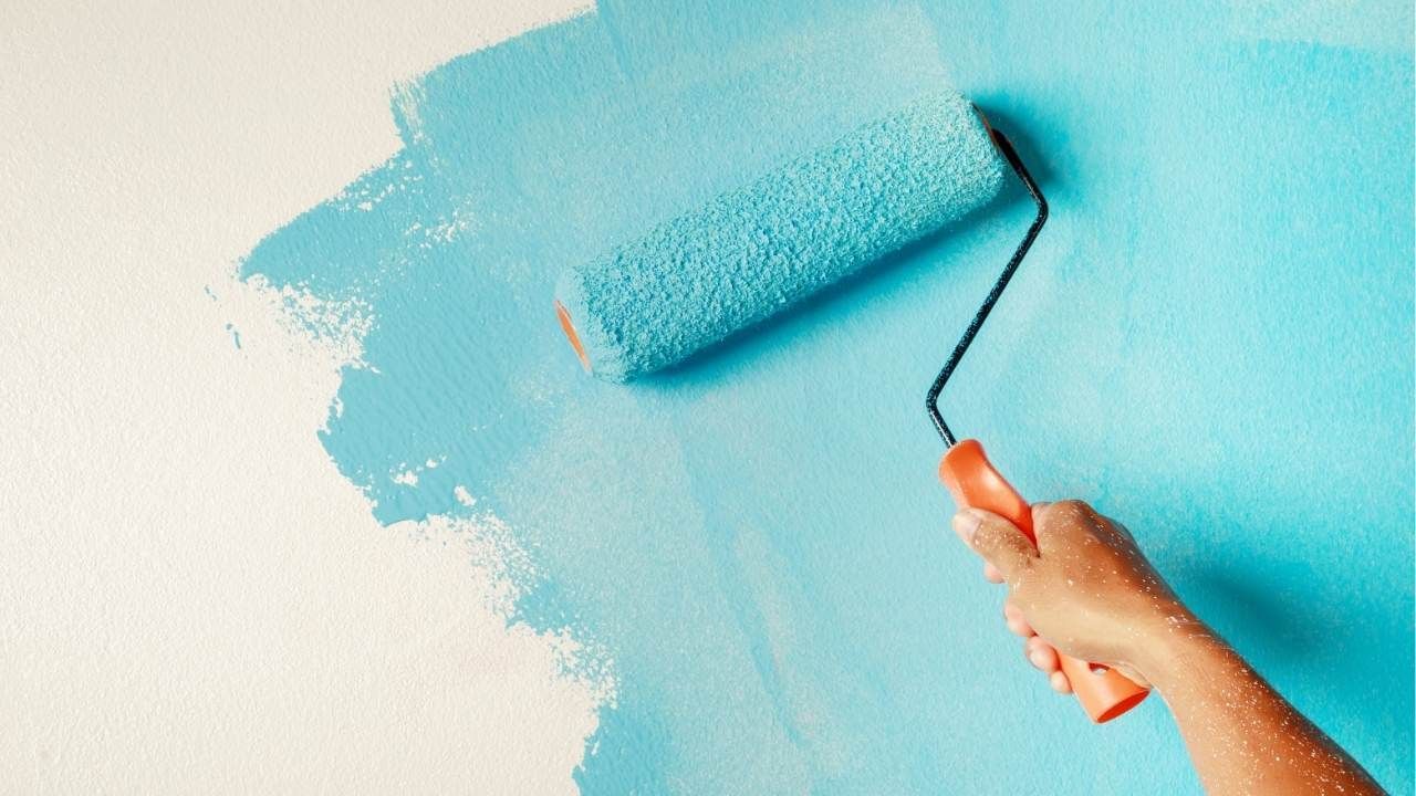
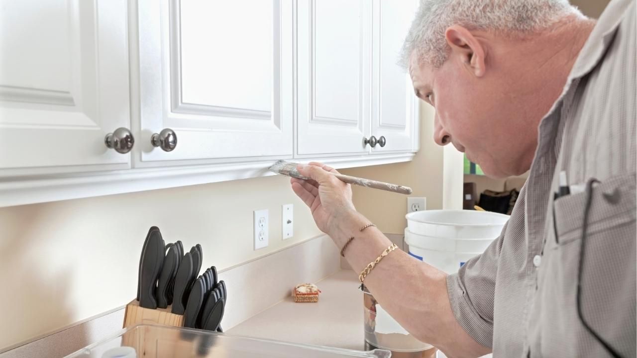
Cooking starts in the mind before it hits the pan, and color has more to do with that than most homeowners realize. The right palette can make a kitchen feel calmer, brighter, and more inviting, which subtly improves how you move, prep, and enjoy meals. That’s why many homeowners now consult painters in Central Oregon when they want a kitchen that feels fresh without losing warmth. A smart kitchen painting plan sets the tone for everything that follows.
In this article, you’ll learn which kitchen paint colors spark creativity, how lighting affects those choices, and how to avoid trends that age poorly. You’ll also see how professionals like Ash Painting of Central Oregon help homeowners translate inspiration into finishes that actually last.
Why Color Matters More Than You Think
Color influences mood, energy, and even appetite. In a kitchen, that influence is amplified because the space is both functional and emotional. People gather there, start their mornings there, and wind down there.
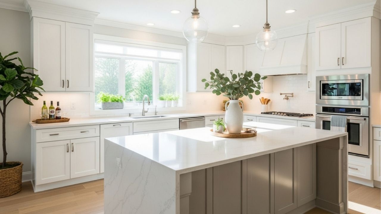
The most inspiring kitchens don’t rely on extremes. Stark white can feel cold, while deep, dark shades can shrink the room visually. Instead, the sweet spot lies in colors that feel natural, balanced, and easy on the eyes during long cooking sessions.
When the environment feels relaxed, cooking becomes less of a chore and more of a ritual.
Paint Colors That Spark Creativity and Comfort
Some colors consistently perform better in kitchens because they work with food, light, and movement rather than against them.
Popular, proven options include:
- Warm off-whites that feel clean without looking sterile
- Soft sage or olive greens that connect the kitchen to nature
- Muted blues or blue-grays that create calm without dullness
- Greige tones that balance warmth and modern appeal
These shades allow cabinetry, countertops, and cookware to stand out while keeping the room visually grounded.
Lighting Changes Everything
A color that looks perfect on a swatch can feel completely different once it’s on the wall. Natural light, under-cabinet lighting, and bulb temperature all influence how paint reads in real life.
North-facing kitchens benefit from warmer tones to counter cooler light. South-facing spaces can handle softer, cooler hues without feeling flat. This is where testing samples on multiple walls becomes essential, not optional.
Good lighting paired with the right color makes cooking feel easier, even on busy nights.
Short Case Study: A Kitchen That Finally Worked
A Bend homeowner loved cooking but avoided their kitchen because it felt dark and cramped. The original deep gray walls absorbed light and made the space feel smaller. After consulting a professional, they switched to a warm off-white with subtle beige undertones and added a soft green accent on a breakfast nook wall. The result was immediate. Natural light bounced better, the room felt larger, and the homeowner reported cooking at home more often because the space finally felt welcoming. No layout changes. No new cabinets. Just the right color choices applied correctly.
Avoid Trend Traps That Date Your Kitchen
Trendy colors move fast, but kitchens are long-term investments. Ultra-dark hues, bold primaries, or overly cool grays can feel exciting today and exhausting tomorrow.
A better approach is choosing timeless base colors and letting personality come from accessories, stools, or décor. Paint should support your lifestyle, not compete with it.
Final Thought
If you want a kitchen that genuinely inspires better meals and better moments, color is not an afterthought, it’s the foundation. Choose shades that work with your light, your habits, and your long-term comfort. When done right, your kitchen doesn’t just look better. It works better.
If you’re ready to upgrade your kitchen’s look and feel,
reach out to a professional who understands how color, light, and craftsmanship come together and start cooking in a space that finally inspires you.
Ash Painting Blogs