Best Paint Colors for Behind the Screen or TV Wall
The wall behind your TV does more than hold a screen, it frames the entire viewing experience. Get the color wrong, and glare, eye strain, and visual clutter creep in fast. Get it right, and your TV blends in, your room feels calmer, and movie nights instantly level up.
In this guide, you’ll learn which paint colors work best behind a screen, why certain shades outperform others, and how to choose a finish that looks sharp with the lights on or off. If you’ve ever wondered why your TV wall feels “off,” this will fix that.
Why TV Wall Color Actually Matters
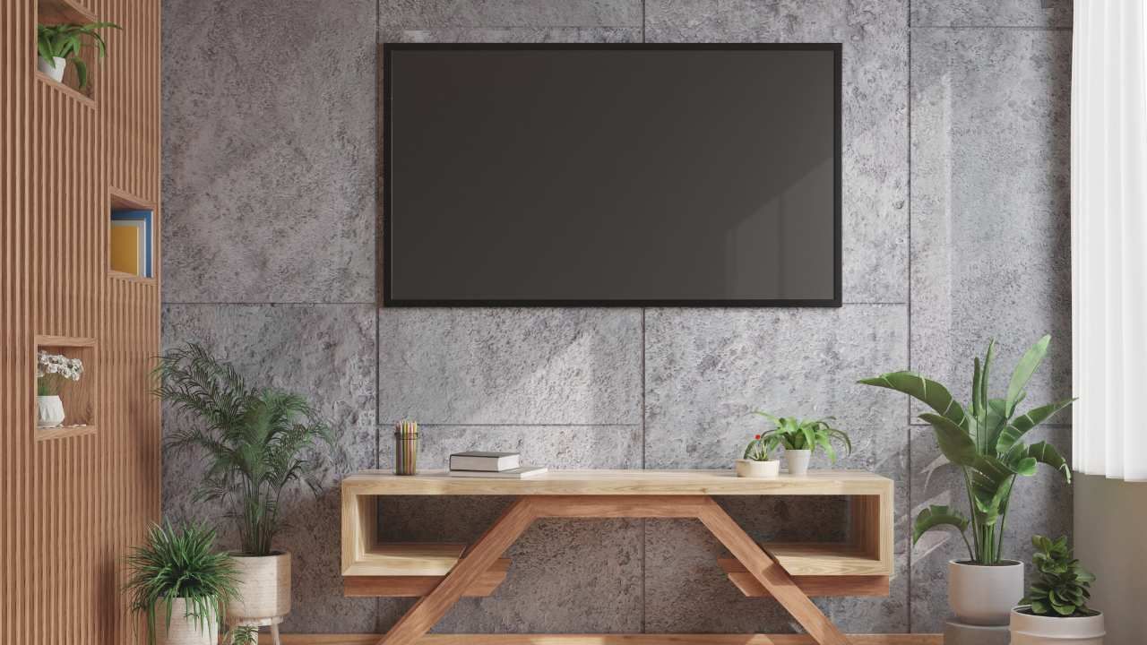
A TV acts like a giant mirror when it’s off and a bright light source when it’s on. Bright or glossy walls bounce light back at your eyes, which is distracting. That’s why experienced painters in Central Oregon often recommend darker, muted tones for media walls, they reduce glare and help the screen visually disappear when not in use.
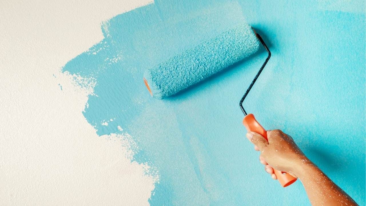
This is also where professional interior wall painting makes a real difference. Clean edges, consistent coverage, and the right sheen all matter more here than on a typical wall.
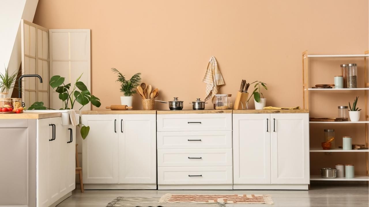
Dark Neutrals: The Safest, Smartest Choice
Dark neutrals are the gold standard for TV walls, and for good reason. They absorb light instead of reflecting it, keeping focus on the screen.
Top picks include:
- Charcoal gray – Modern, clean, and pairs with almost any décor
- Deep greige – A warm gray-beige hybrid that feels upscale, not cold
- Soft black – Bold but surprisingly forgiving when done in a matte finish
These colors work especially well in open-concept homes where the TV wall needs definition without screaming for attention.
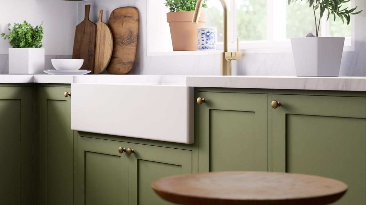
Earthy Mid-Tones for a Softer Look
If dark walls feel too dramatic, earthy mid-tones are your next best option. They still reduce glare but keep the room lighter and more casual.
Great options:
- Warm taupe – Subtle contrast without going dark
- Muted olive – Adds depth while staying easy on the eyes
- Clay or mushroom tones – Perfect for cozy living spaces
These shades shine in family rooms where the TV shares space with everyday living.
Cool Colors to Use Carefully
Blues and greens can work, but only when they’re toned down. Bright or icy versions create reflections and color distortion on the screen.
If you go this route, stick to:
- Smoky blue-gray
- Desaturated teal
- Dusty slate green
Always test samples with the TV on and off before committing.
Finish Matters More Than You Think
Color gets the spotlight, but finish seals the deal. Glossy paint is a hard no, it reflects everything. Semi-gloss is only slightly better.
The best choices:
- Matte – Maximum glare reduction, best for dedicated media rooms
- Eggshell – A solid compromise for living rooms that need durability
A seasoned crew like Ash Painting of Central Oregon knows how to match the right finish to the room’s lighting and usage, not just the color.
A Quick Real-World Example
A Bend homeowner recently struggled with harsh reflections from a bright beige TV wall. After switching to a matte charcoal gray, the change was immediate. The TV blended seamlessly into the wall, daytime glare vanished, and the room felt more intentional. The homeowner didn’t upgrade the TV, just the paint and the space finally worked the way it should.
Final Takeaway
Your TV wall isn’t the place to play it safe with builder beige or shiny paint. Dark neutrals and muted tones win every time, especially when paired with the right finish and clean execution.
If you want a TV wall that looks right day and night, start with smart color choices and make sure the work is done right the first time. Contact us today to schedule a color consultation and give your home cinema the backdrop it deserves.
Ash Painting Blogs