Calm, Cozy, or Bold? What Your Bedroom Color Says About You
Your bedroom isn’t just where you sleep, it’s where your brain shuts up, your body resets, and your mood gets recalibrated. The color you choose does more heavy lifting than most people realize. It influences how calm you feel at night, how energized you feel in the morning, and whether your space feels like a retreat or a stress box. This guide breaks down what your bedroom color choice really says about you and how to choose one that actually works.
You’ll learn how calm, cozy, and bold colors affect mood, which personalities gravitate toward each, and how to make the choice feel intentional instead of impulsive. If you’re searching for a "painting contractor near me in Central Oregon," this insight helps you avoid regret once the paint dries.
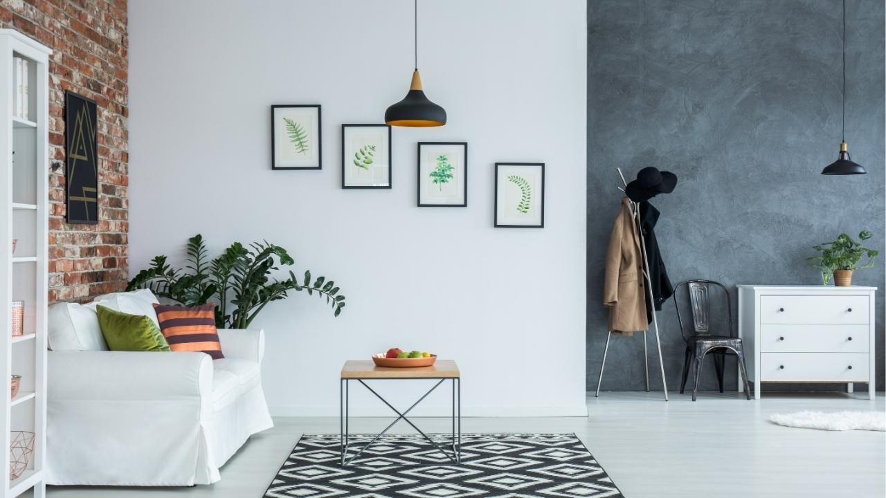
Calm Colors: You Crave Peace and Control
Soft blues, muted greens, pale grays, and gentle lavenders are the go-to choices for people who value mental clarity and emotional balance. If this is your lane, you likely want your bedroom to feel predictable, quiet, and restorative.
These colors reduce visual noise and help signal your nervous system that it’s safe to relax. They’re especially effective if you deal with stress, anxiety, or a job that keeps your mind racing late into the night. Calm colors don’t beg for attention, and that’s the point. They let your body slow down without distraction.
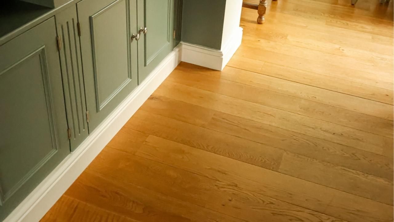
The downside? If overdone, these shades can feel flat or cold. The fix is texture: warm lighting, layered fabrics, or wood tones to keep the room from feeling sterile.
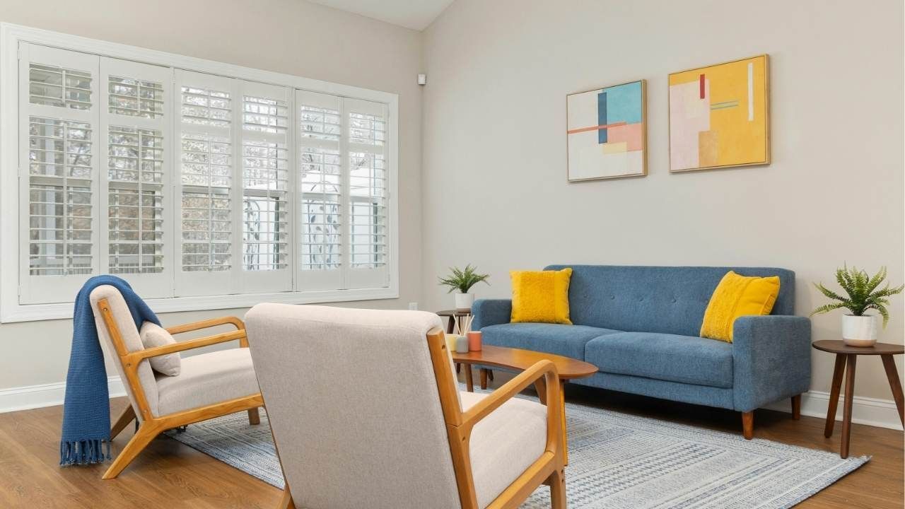
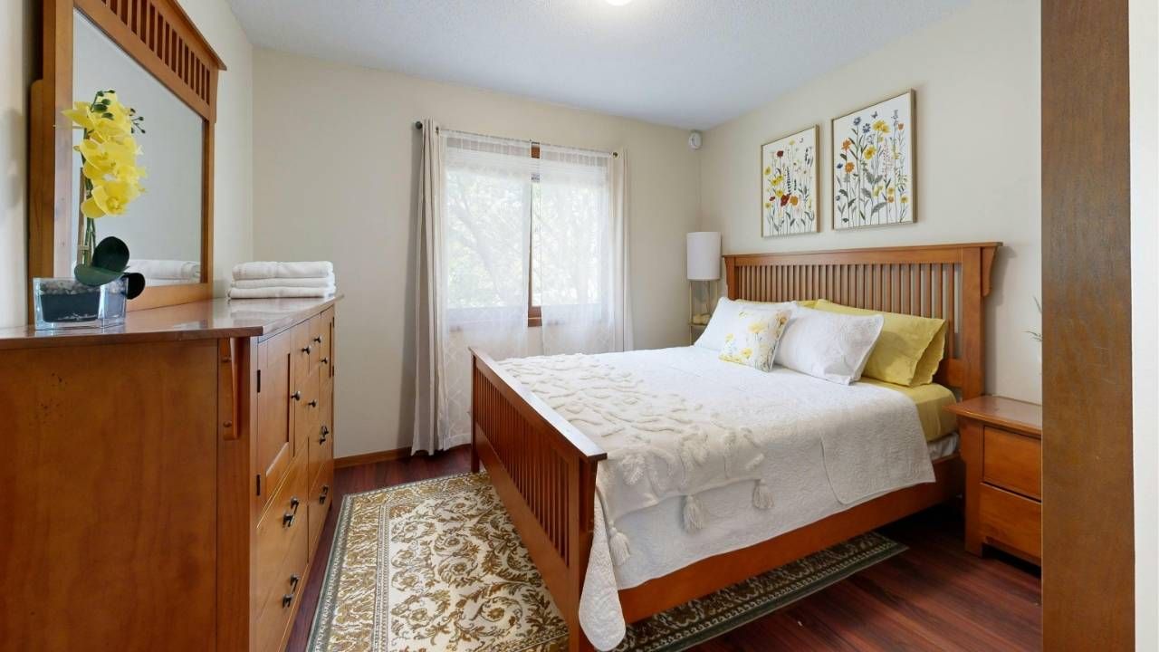
Cozy Colors: You Value Comfort Over Trends
Warm neutrals, creamy whites, soft taupes, and earthy beiges are for people who want their bedroom to feel like a hug. You probably care more about comfort than making a design statement, and that’s not a flaw, it’s self-awareness.
Cozy colors create emotional safety. They work especially well in bedrooms with limited natural light because they don’t amplify shadows or harsh contrast. These shades also age well, meaning you won’t feel the urge to repaint every two years.
This is where Ash Painting of Central Oregon often guides homeowners who want a timeless look without sacrificing warmth. When paired with quality professional painting services, these subtle tones look intentional instead of bland.
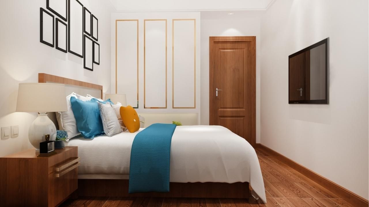
Bold Colors: You’re Expressive and Decisive
Deep navy, charcoal, forest green, terracotta, or even black signal confidence. People who choose bold bedroom colors usually know what they like and aren’t afraid of commitment.
Bold doesn’t mean chaotic. When used correctly, darker or saturated colors can make a bedroom feel grounded, intimate, and sophisticated. They work best when balanced with lighter bedding, strategic lighting, and clean lines.
The mistake most people make is going all-in without a plan. Bold colors demand precision. One wrong undertone or uneven finish can turn “dramatic” into “oppressive” fast.
Case Study: One Room, Two Outcomes
A homeowner in Bend initially painted their bedroom a bright, trendy blue using a DIY kit. The color looked great online, but in the actual room, it felt harsh and restless. Sleep suffered, and the space never felt finished.
After consulting a local pro, they repainted using a muted blue-gray with warmer undertones. The difference was immediate. The room felt calmer, the lighting softened, and the homeowner reported better sleep within a week. Same room. Smarter color choice.
Choose With Intention
Your bedroom color shouldn’t be chosen in a rush or copied from a reel. It should reflect how you want to feel every night and every morning.
Before you commit, test samples in real lighting or
get in touch with a professional who understands how color behaves in your space. The right choice pays off every single day.
Ash Painting Blogs