Two-Tone Wall Painting Ideas for Modern Homes
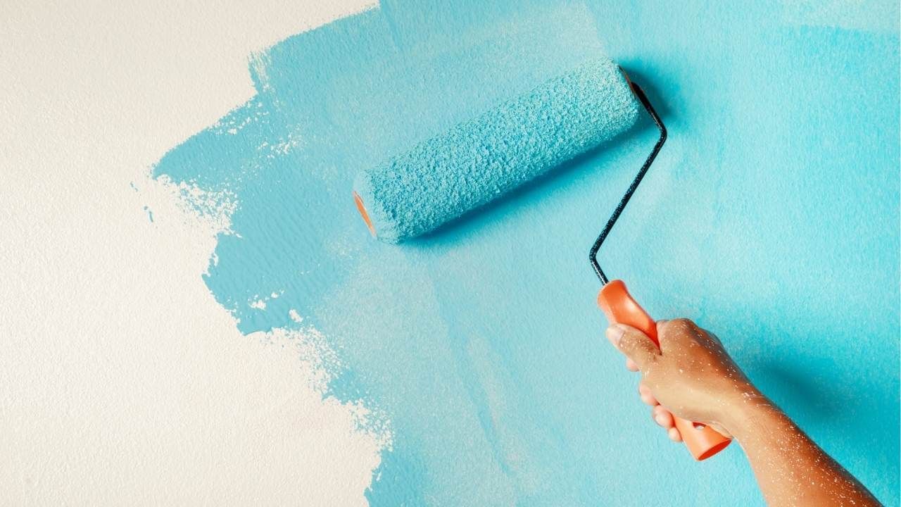
A single paint color can make a room feel clean and simple, but it can also leave the space looking flat. Two-tone walls add contrast, shape, and personality without requiring expensive remodeling or complicated design work.
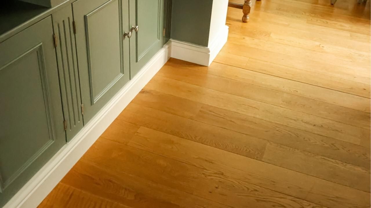
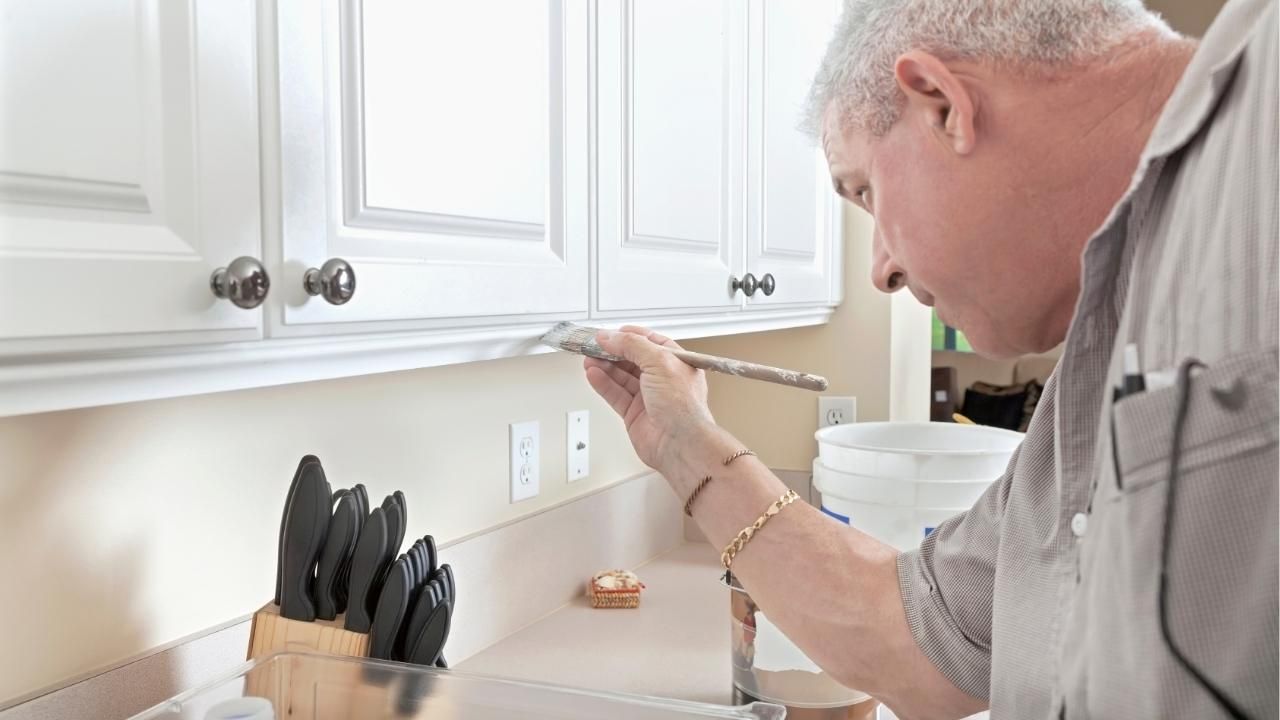
Homeowners can use this approach to make ceilings appear higher, define open spaces, or create a focal point that feels modern rather than overly dramatic. Working with Ash Painting of Central Oregon can also help you choose combinations that suit the room’s lighting, architecture, and existing finishes. Experienced providers of Central Oregon painting services understand how local light, flooring tones, and home styles can influence the final result. Skilled interior painting contractors can then create sharp lines and consistent coverage that are difficult to achieve with rushed do-it-yourself work.
In this guide, you will learn how to select two-tone color combinations, decide where to divide the wall, and avoid common design mistakes.
Why Two-Tone Walls Work So Well
Two-tone wall designs create visual interest by breaking up a large surface. Instead of relying on artwork, shelving, or decorative panels, the paint itself becomes part of the room’s design.
This technique can also solve practical design problems. A darker lower section may help hide everyday scuffs in hallways, dining rooms, and children’s spaces. A lighter upper section can reflect more natural light and prevent the room from feeling closed in.
Two-tone walls are especially useful when you want to:
- Add depth without making the room feel busy
- Highlight architectural details
- Make a narrow room appear wider
- Create a clear focal wall
- Separate zones in an open floor plan
- Introduce a bold color in a controlled way
The key is choosing a layout that supports the room rather than dividing it awkwardly.
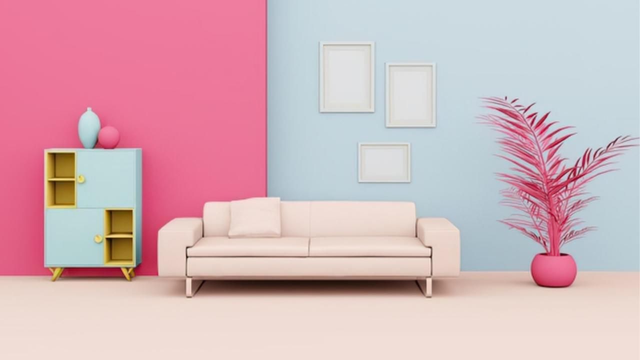
Modern Two-Tone Wall Painting Ideas
There is no single formula for a successful two-tone wall. The best approach depends on the size of the room, the ceiling height, and the mood you want to create.
1. Darker Color on the Bottom
One of the most popular arrangements places a darker color on the lower third or lower half of the wall. The upper section remains lighter, helping the room feel balanced and open.
This works particularly well in:
- Dining rooms
- Hallways
- Home offices
- Bedrooms
- Family rooms
A charcoal lower wall paired with warm white can feel crisp and architectural. Deep green with soft beige creates a calmer, more natural look. Navy and pale gray can give the room a polished, contemporary finish.
For a more traditional feel, align the color break with chair-rail height. For a modern look, position the division slightly higher or lower than expected.
2. Lighter Color on the Bottom
Reversing the usual arrangement can create a bold, unexpected effect. A light lower section grounds the room gently, while a deeper shade above draws attention upward.
This approach works best in rooms with good natural light and reasonably high ceilings. It can also make bedrooms and lounges feel more intimate.
Consider combinations such as:
- Soft white below with muted blue above
- Light taupe below with dark olive above
- Pale gray below with warm terracotta above
- Cream below with deep brown above
Because dark upper walls can make a small room feel lower, test the idea before committing to the full space.
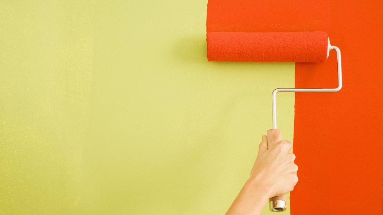
3. Vertical Color Blocking
Two-tone walls do not need to be divided horizontally. Vertical blocks can define a reading corner, desk area, dining zone, or entertainment wall.
For example, a broad strip of color behind a home-office desk can visually separate the workspace from the rest of the room. A contrasting section behind a sofa can make the seating arrangement feel more intentional.
Vertical color blocking is especially useful in open-concept homes because it creates separation without adding walls or bulky furniture.
4. Two Shades From the Same Color Family
Using two shades of the same color is one of the safest ways to create a polished result. The contrast feels noticeable, but the room still looks unified.
Try pairing:
- Sage with deep forest green
- Powder blue with slate blue
- Light greige with mushroom brown
- Blush with muted clay
- Pale gray with charcoal
This approach is ideal for homeowners who want more dimension without introducing a strong color clash.
How to Choose the Right Color Pairing
A color combination may look attractive on a small sample but behave differently across an entire wall. Lighting, flooring, furniture, and room orientation can all change how paint appears.
Start by identifying the undertones already present in the room. Warm wood flooring usually works well with cream, beige, olive, clay, and warm gray. Cooler flooring may pair better with crisp white, blue-gray, charcoal, or muted green.
Before choosing your final colors, consider these factors:
- Natural light: North-facing rooms often need warmer shades, while bright south-facing rooms can handle cooler colors.
- Ceiling height: A lighter upper wall usually makes the ceiling feel higher.
- Room size: Strong contrast can energize a large room but overwhelm a very small one.
- Fixed finishes: Cabinets, countertops, stone, and flooring should guide the palette.
- Furniture colors: Paint should support the furnishings rather than compete with them.
Always test large sample areas on more than one wall. Observe them in the morning, afternoon, and evening before making a final decision.
Where Should the Two Colors Meet?
The placement of the dividing line can change the entire feel of the room. A half-and-half split creates a strong, graphic look, while a lower division often feels more subtle.
Common placements include:
- One-third of the way up the wall
- Standard chair-rail height
- Exactly halfway up the wall
- Two-thirds of the way up
- Aligned with windows, cabinetry, or shelving
Use architectural features as natural stopping points whenever possible. A line that connects with a window ledge or built-in shelf usually looks more intentional than one placed at a random height.
For rooms with low ceilings, keep the darker color below the halfway point. This allows the lighter upper wall to create a greater sense of height.
Common Two-Tone Painting Mistakes to Avoid
Two-tone walls look simple, but small errors can make the finished room feel unbalanced.
Choosing Colors With Conflicting Undertones
Two neutral colors can still clash. A cool gray beside a yellow-based beige may look mismatched even when both shades appear attractive on their own.
Compare samples directly beside each other and against the room’s permanent finishes.
Creating an Uneven Dividing Line
A slightly crooked line becomes obvious once furniture and wall décor are added. Proper measuring, leveling, taping, and sealing are essential for a clean edge.
Textured walls can make this even harder because paint may bleed beneath the tape.
Using Too Much Contrast
Black and white can look dramatic, but extreme contrast is not always the best fit for a relaxed living space. Muted combinations often age better and are easier to coordinate with future décor changes.
Ignoring Trim and Ceiling Colors
Trim acts as a third color in the room. Make sure the wall shades work with the baseboards, doors, crown molding, and ceiling paint.
A warm wall palette paired with bright blue-white trim can create an unwanted disconnect.
Short Case Study: Updating a Dated Living Room
A homeowner wanted to refresh a beige living room without replacing the flooring or furniture. The room had warm oak floors, cream upholstery, and limited wall décor. A muted olive shade was applied to the lower third of the walls, while a soft warm white covered the upper section. The dividing line was positioned just below the window ledges, creating a natural visual break. The darker lower color added depth and helped conceal marks in the busiest part of the room. The lighter upper section kept the space bright. With minimal changes beyond paint, the room felt more modern, structured, and welcoming.
Is a Two-Tone Wall Right for Your Home?
Two-tone walls offer more flexibility than a standard single-color paint job. They can feel subtle and elegant, bold and creative, or warm and grounded depending on the colors and layout you choose.
The strongest results come from careful planning. Color undertones, room proportions, lighting, and line placement all need to work together. Professional preparation also matters because clean edges and even coverage are central to the design.
A well-planned two-tone wall does more than update a room. It changes how the space feels, draws attention to its best features, and gives the home a more finished appearance.
Create a More Modern Interior With Professional Painting
Ready to give your home more depth, character, and visual appeal?
Schedule a professional color consultation and start planning a two-tone wall design that fits your space, lighting, and personal style.
Ash Painting Blogs