Perfect Trim and Shutter Color Combinations to Complement Your Home
First impressions matter, and your home’s exterior makes them fast. The right trim and shutter colors can sharpen architectural lines, boost curb appeal, and quietly signal good taste. If you’re planning a refresh or working with an exterior painter in Central Oregon, this guide shows how to pair colors that actually elevate your home instead of fighting it.
Here’s what you’ll learn: how classic combos work, when contrast helps (or hurts), how materials and surroundings influence color, and how to avoid common mistakes. You’ll also see a real-world mini case study to ground the advice.
Classic Color Pairings That Always Work
Timeless combinations endure because they’re balanced and versatile. They complement a wide range of siding colors and home styles, from craftsman to colonial.
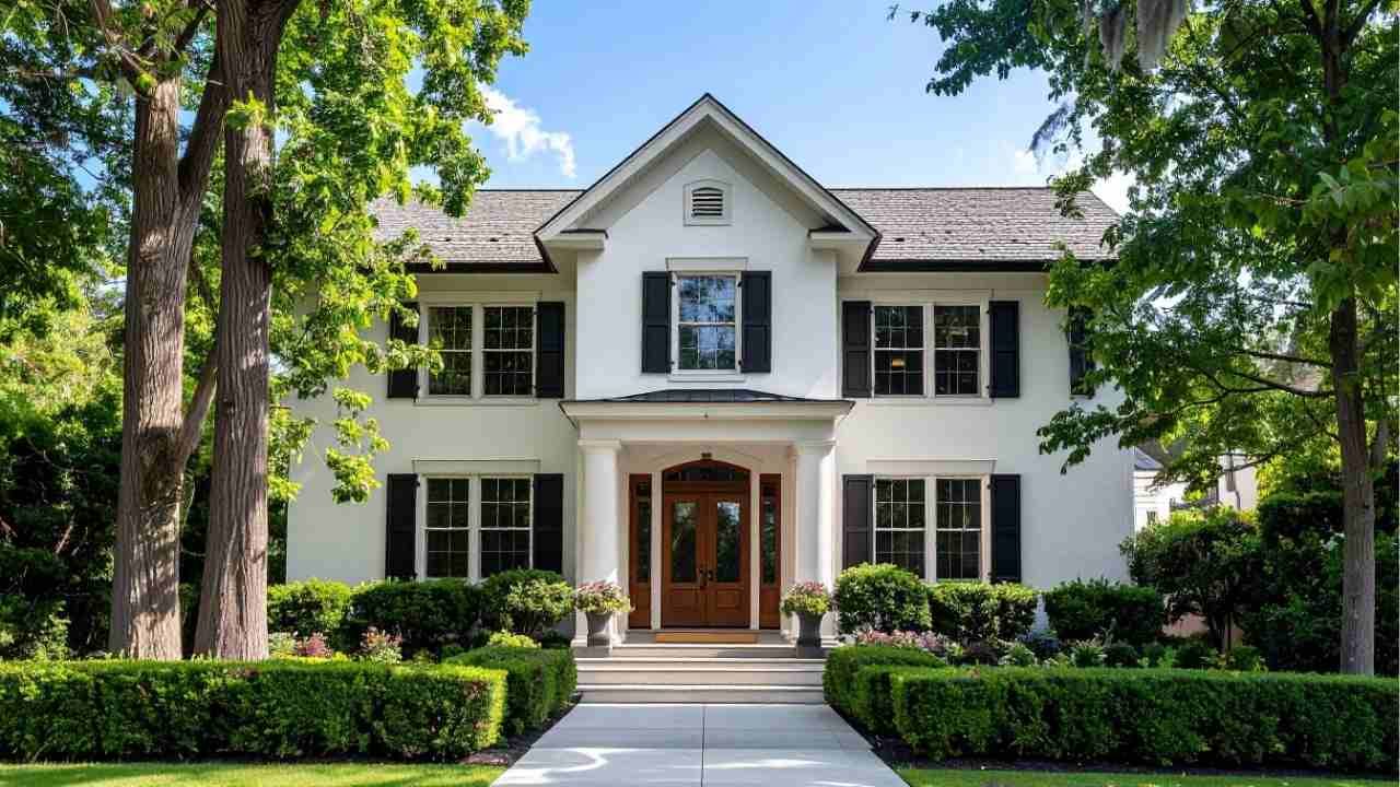
- White trim + black shutters: Clean, crisp, and architectural. Ideal for traditional homes that need definition.
- Cream trim + deep brown shutters: Warm and inviting, especially effective with stone or brick.
- Light gray trim + charcoal shutters: Modern without feeling cold; works beautifully on contemporary facades.
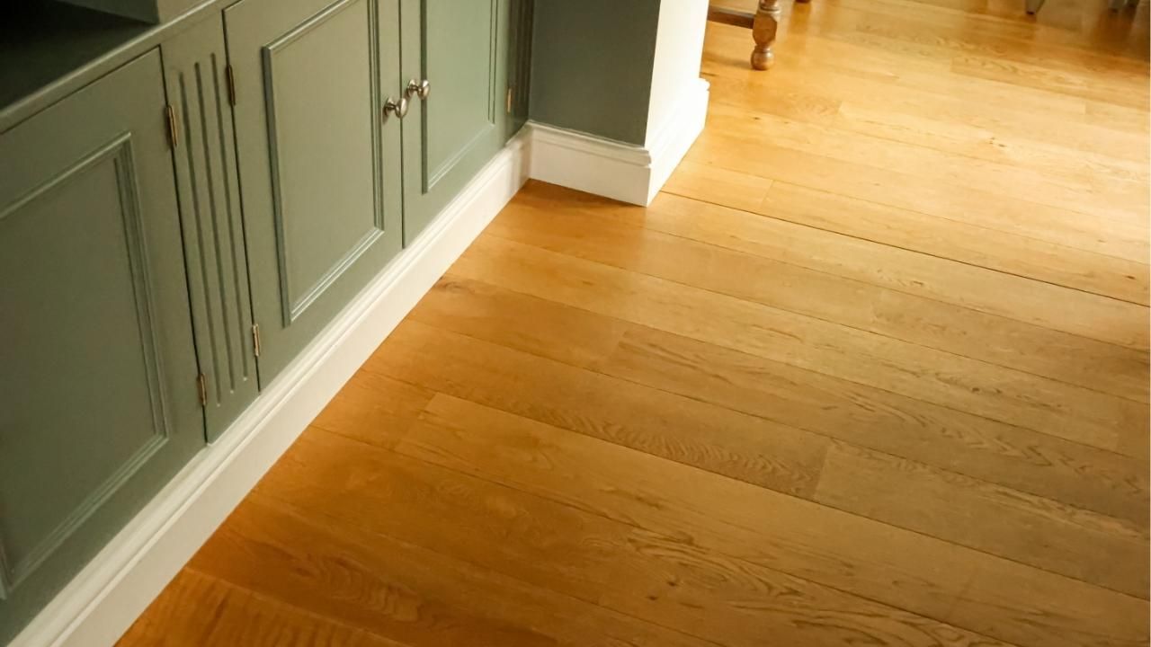
Pro tip: Keep trim lighter than siding to outline windows and rooflines without overwhelming the structure.
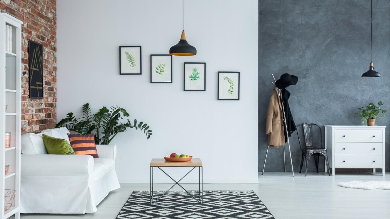
Using Contrast to Add Character (Without Overdoing It)
Contrast is powerful, use it intentionally. High contrast draws the eye to windows and doors, while low contrast creates a softer, cohesive look.
- Navy siding + white trim: Sharp, coastal, and upscale.
- Sage green siding + cream trim: Earthy and calm, perfect for wooded settings.
- Bold shutters (red, blue, forest green): Best as accents, keep trim neutral so the shutters shine.
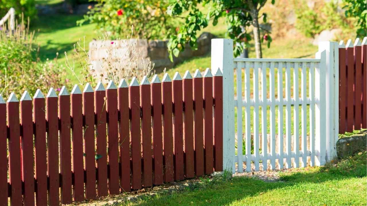
If your property includes features like fence building, coordinate those finishes with trim tones to avoid visual clutter. Consistency across elements reads as intentional design.
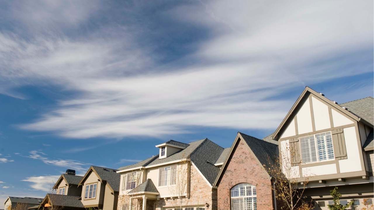
Matching Colors to Architecture and Surroundings
Your home’s style and setting should guide your palette more than trends.
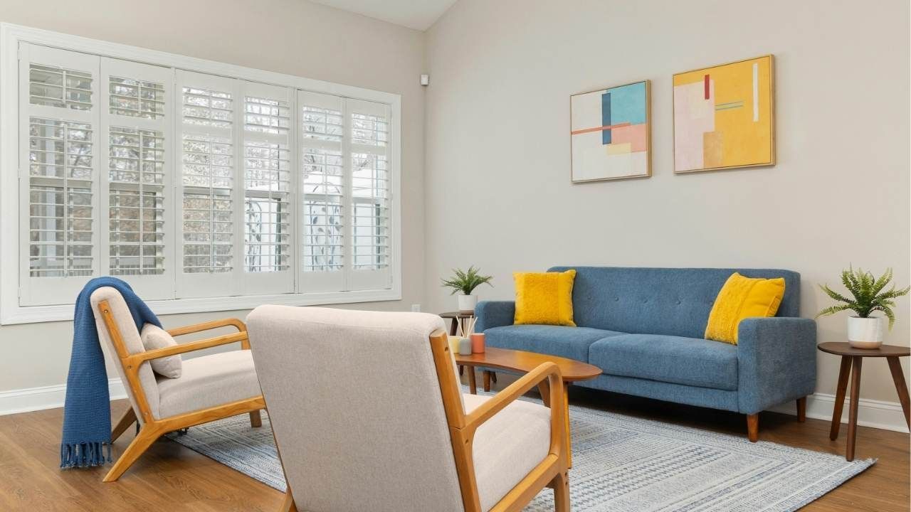
- Traditional homes look best with classic contrasts and restrained colors.
- Modern homes can handle monochrome palettes with subtle tonal shifts.
- Rural or wooded lots benefit from warm neutrals and muted greens or browns.
- Urban settings often suit sharper contrasts and cooler grays.
Always test paint samples outdoors at different times of day. Sunlight can dramatically shift undertones, what looks warm at noon may read muddy at dusk.
Common Mistakes to Avoid
Even great colors can fail with poor execution. Watch out for these pitfalls:
- Too many colors competing for attention
- Ignoring roof color, which anchors the entire palette
- Ultra-trendy hues that date quickly
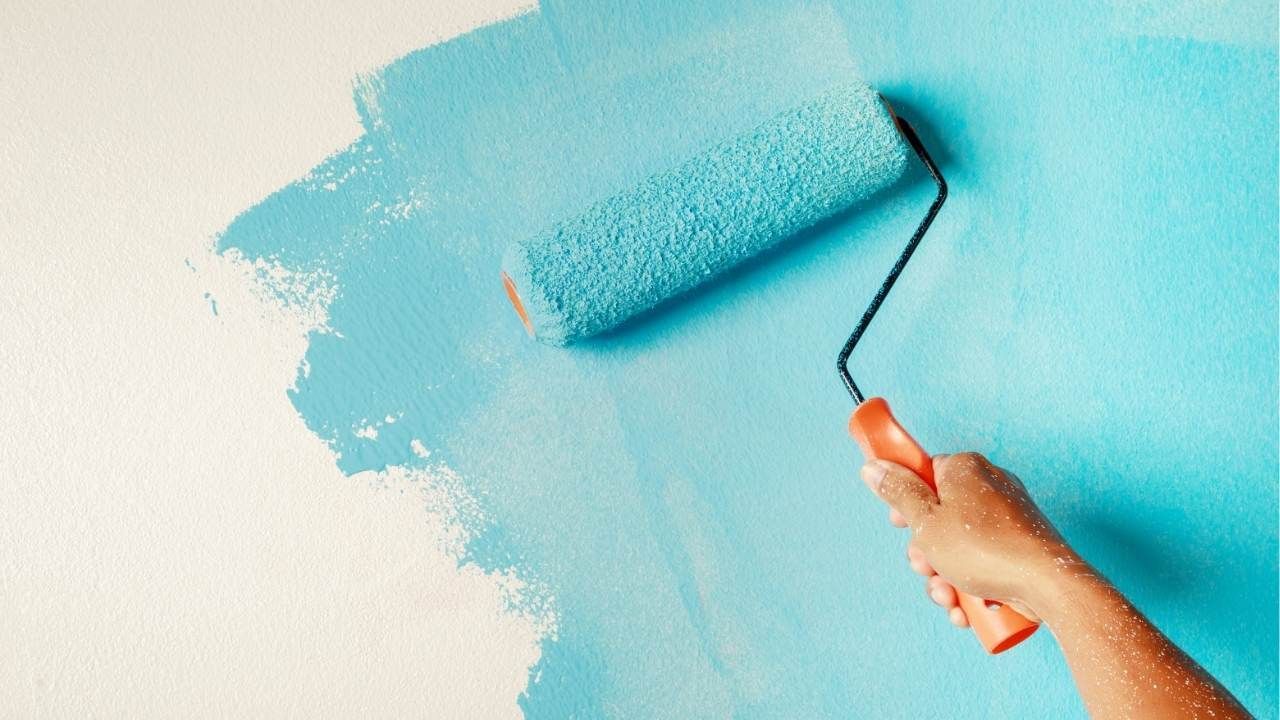
- DIY shortcuts that lead to uneven lines or poor adhesion
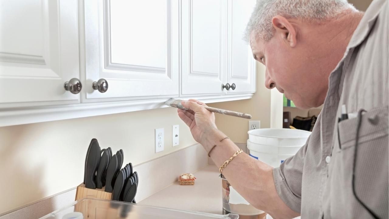
This is where hiring the best painting contractor pays off, precision and prep matter just as much as color choice.
Short Case Study: From Flat to Polished
A 1980s beige home felt dull and outdated. The solution wasn’t bold, it was smart. The owners chose a warm greige siding, crisp white trim, and deep charcoal shutters. The roof’s dark gray tones tied everything together. Window lines popped, the entry felt intentional, and the home’s value perception jumped immediately. The project stayed within budget, avoided trendy risks, and delivered a polished look that still turns heads years later.
Final Takeaway
Trim and shutter colors aren’t decoration, they’re structure, emphasis, and mood rolled into one. Choose combinations that respect your home’s style, surroundings, and long-term value. When in doubt, lean classic, test in real light, and work with pros who sweat the details.
Ready to upgrade your curb appeal? Start by narrowing two solid color combos, test them outdoors, and
book a professional consultation to lock it in right the first time.
Ash Painting Blogs